maribel bar
the concept
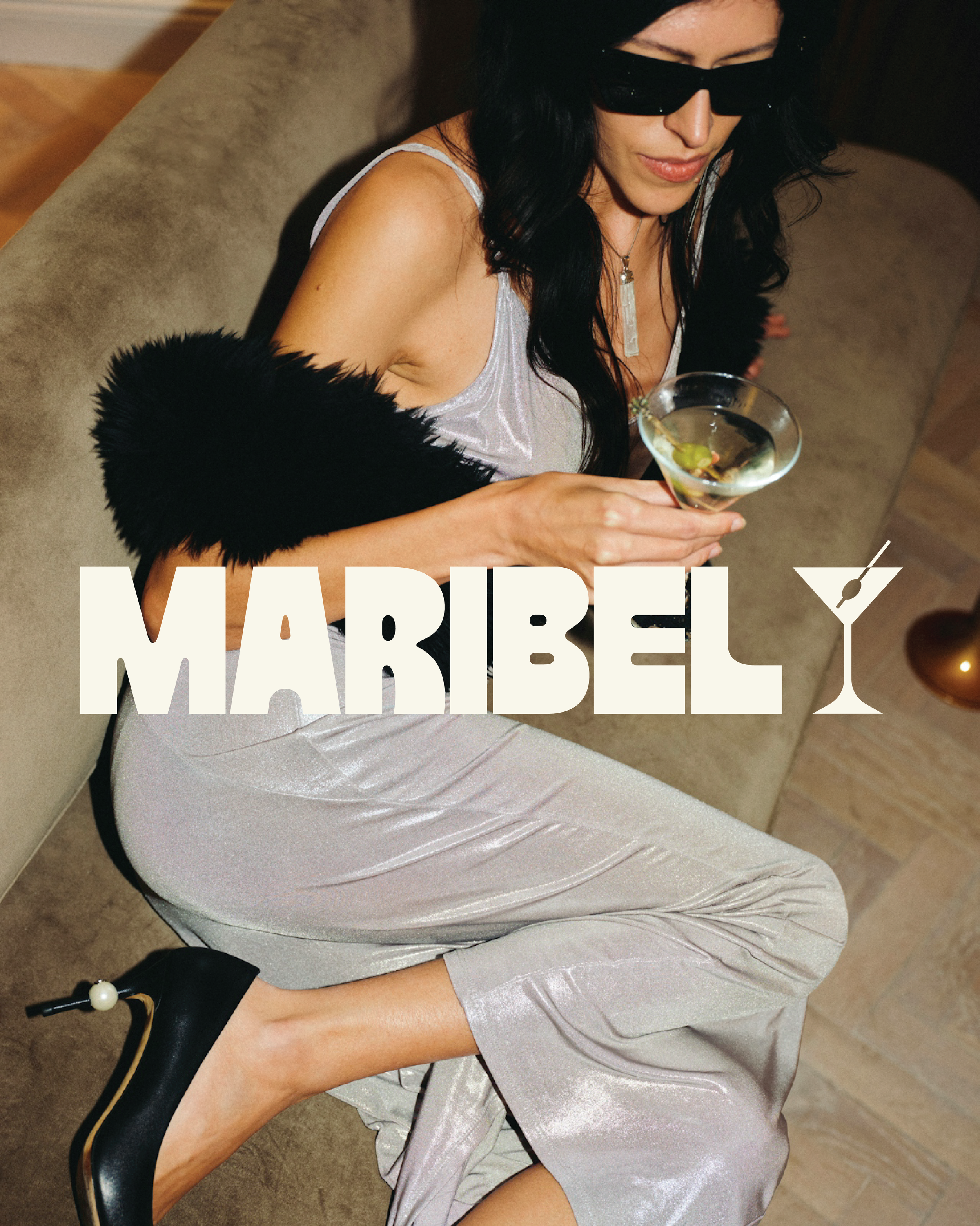
maribel is a self-directed hospitality branding project exploring how visual identity can shape the perception of a place.
The concept centers on an intimate bar that feels elevated yet approachable, blending the nostalgia of vintage nightlife with a more contemporary sensibility. The goal was to create a brand that feels warm, personal, and quietly luxurious rather than overly polished or exclusive.
visual direction
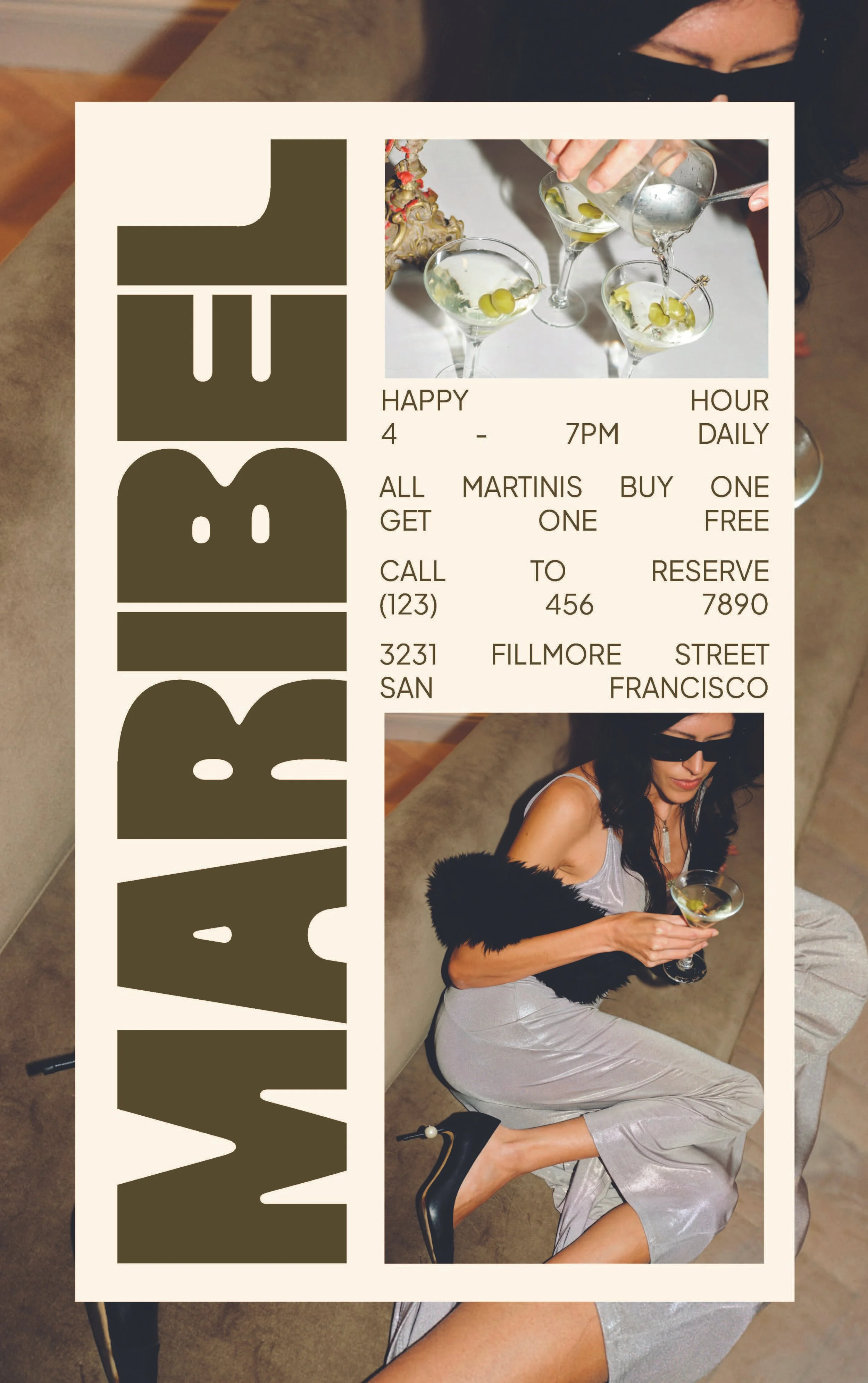
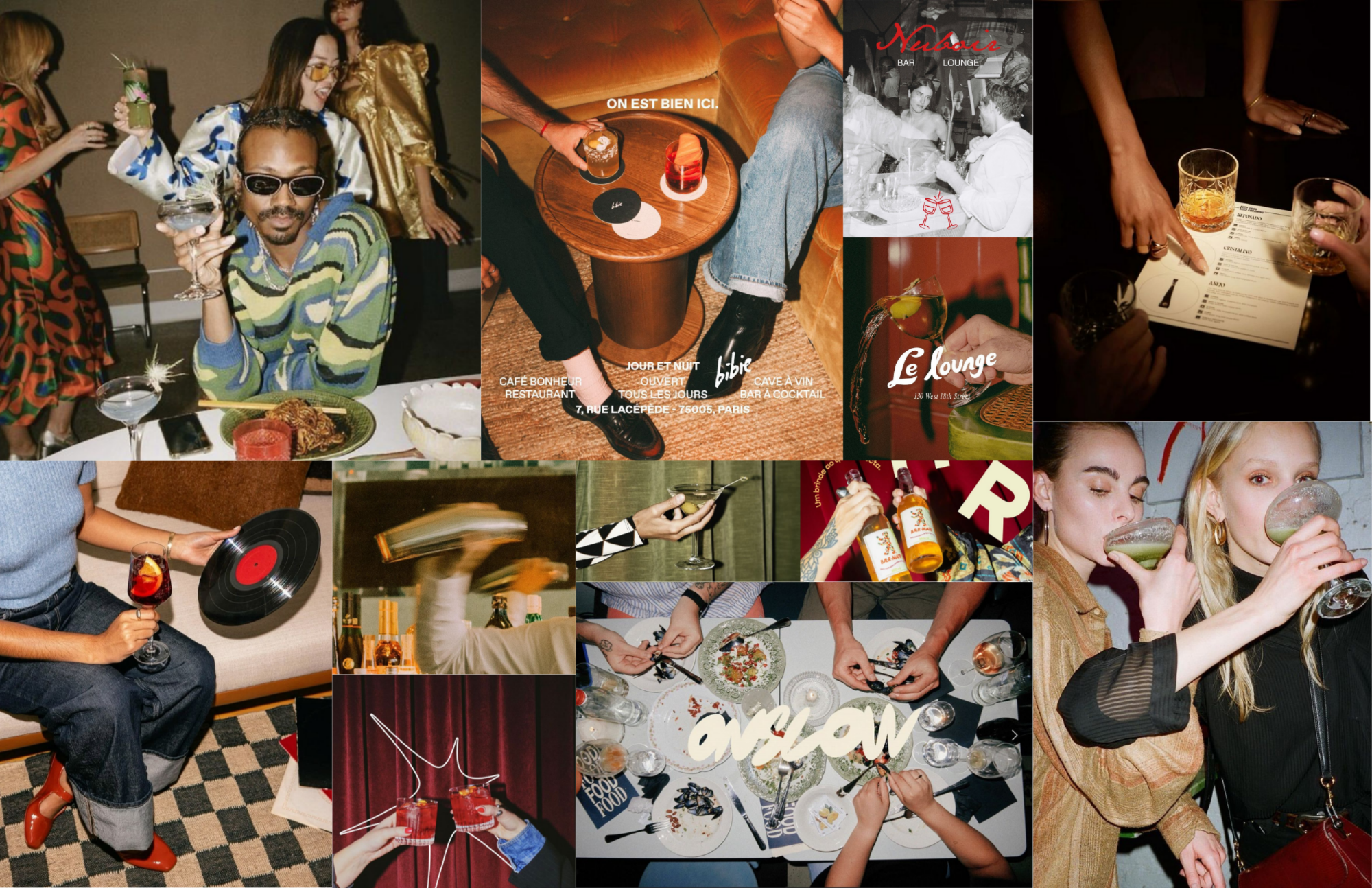
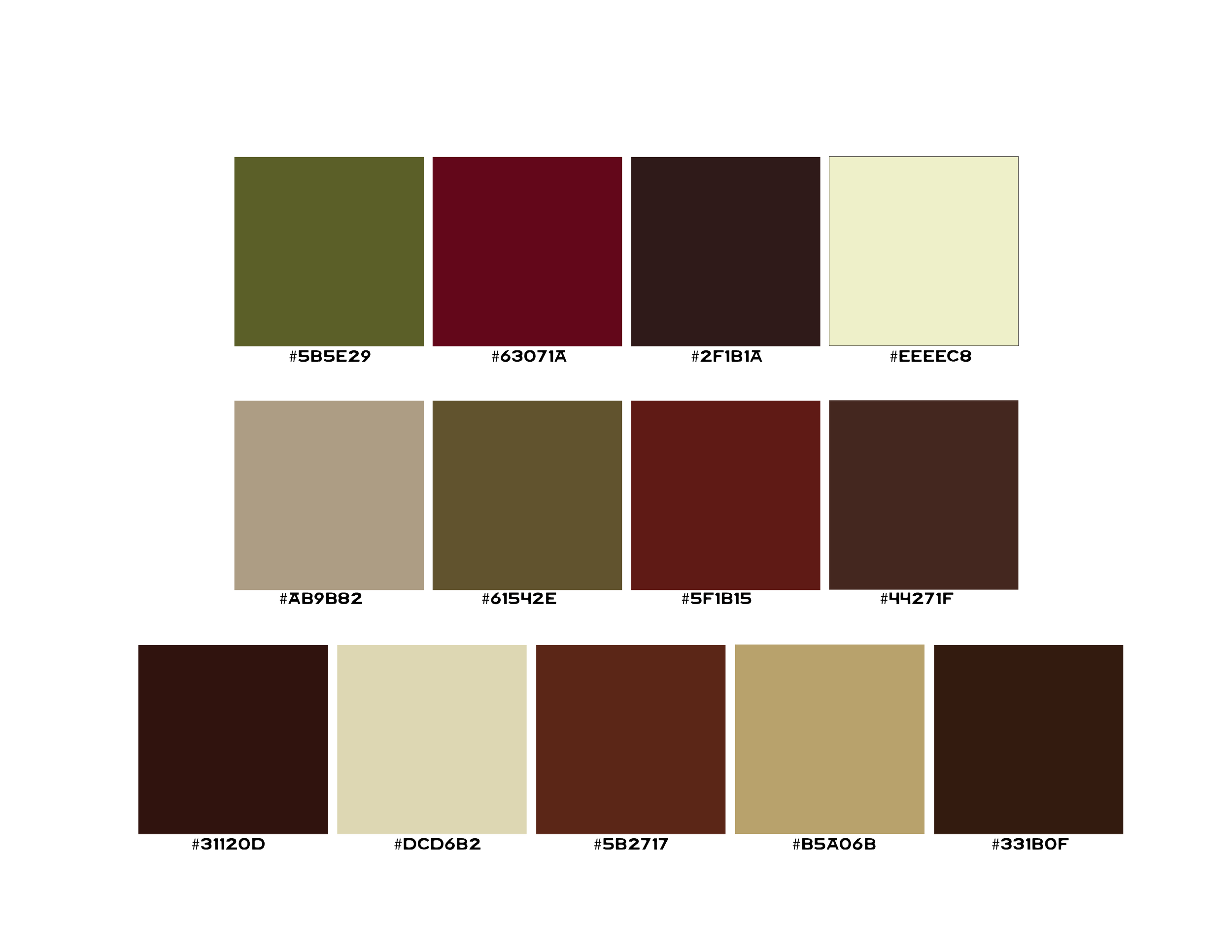
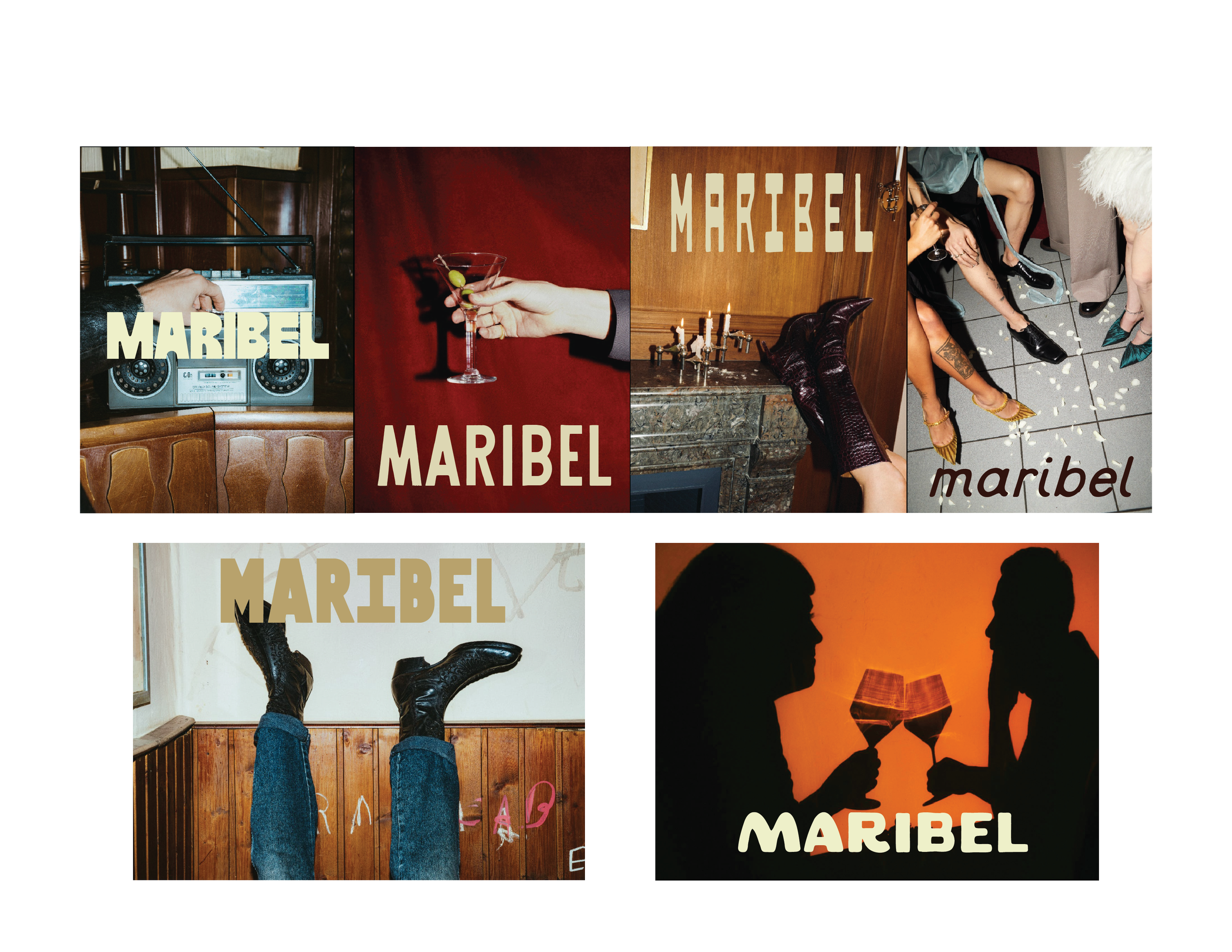
The visual direction draws from vintage nightlife, warm ambient lighting, tactile materials, and moments of connection. These references established a world that feels nostalgic yet contemporary, with a sense of intimacy and understated indulgence.
This direction became the foundation for the identity, guiding the use of typography, color, composition, and supporting details.
progress
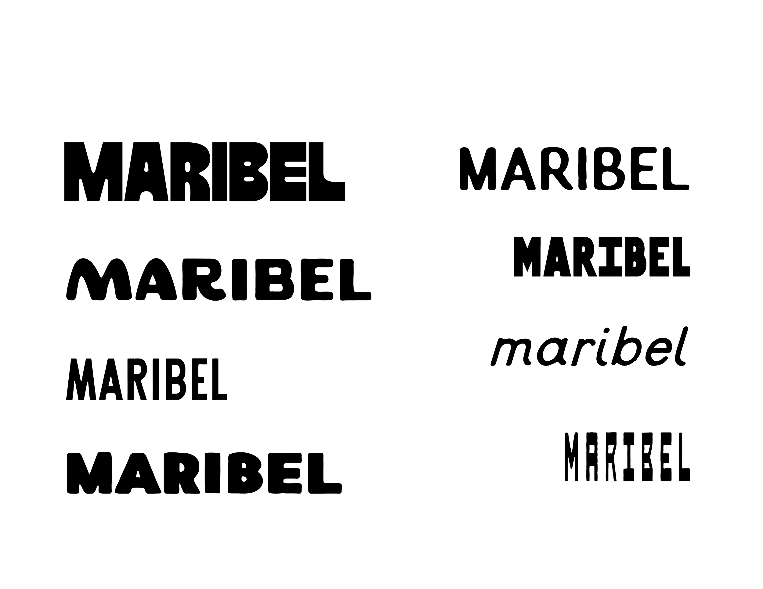
I explored different typographic directions and logo variations to find the right balance between expression and restraint. The challenge was creating an identity with enough personality to feel distinctive while remaining refined and approachable.
Through testing type, color relationships, and early applications, I refined the direction into a visual system that could carry the brand consistently across different touchpoints.
outcome
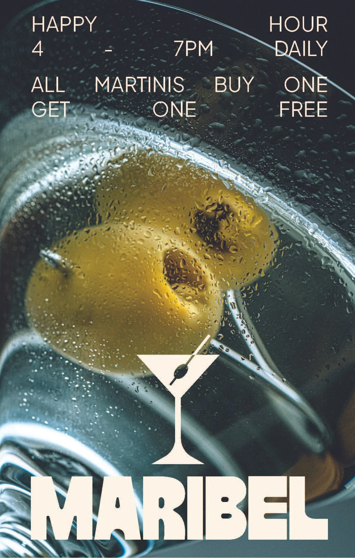
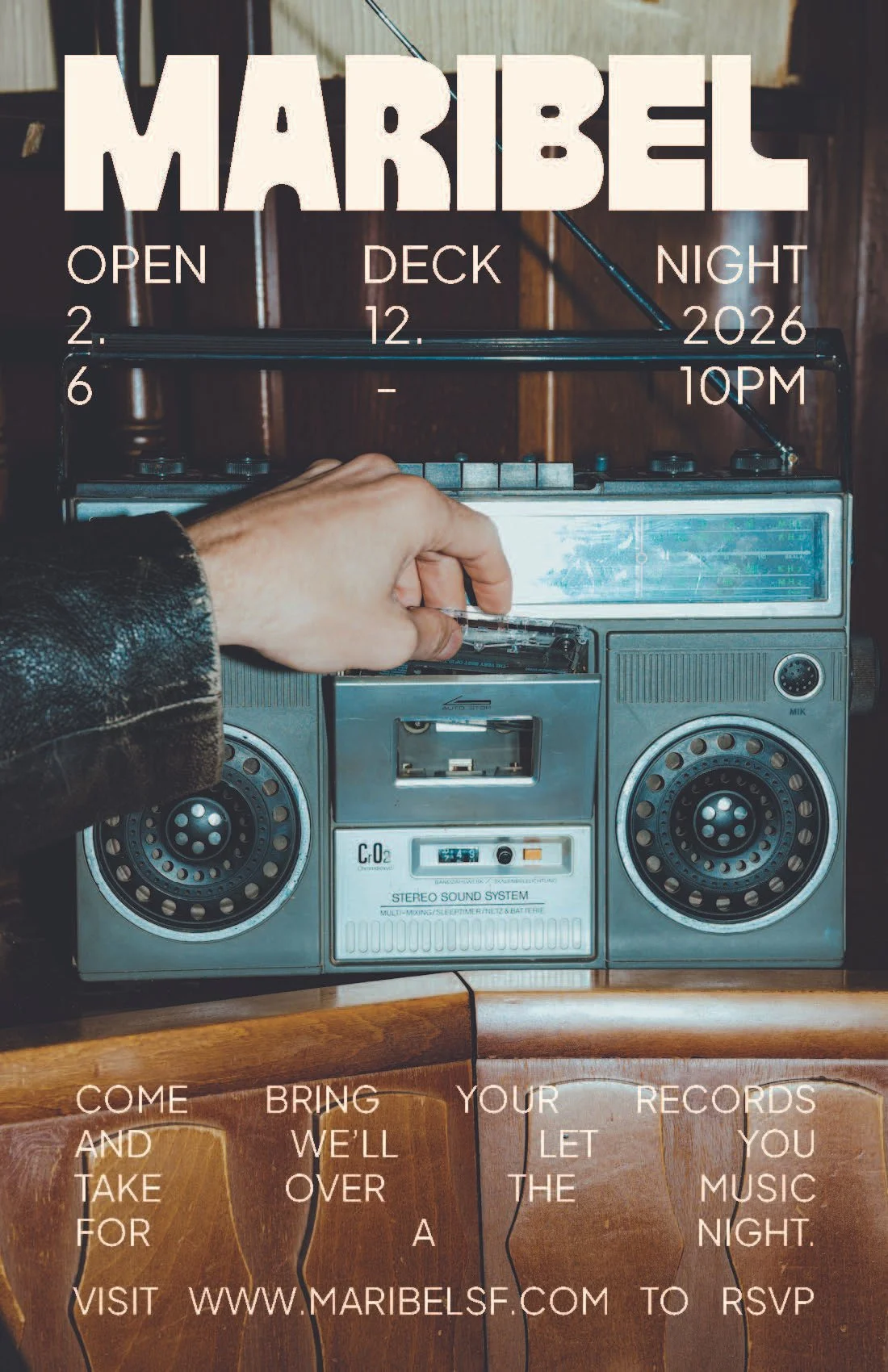
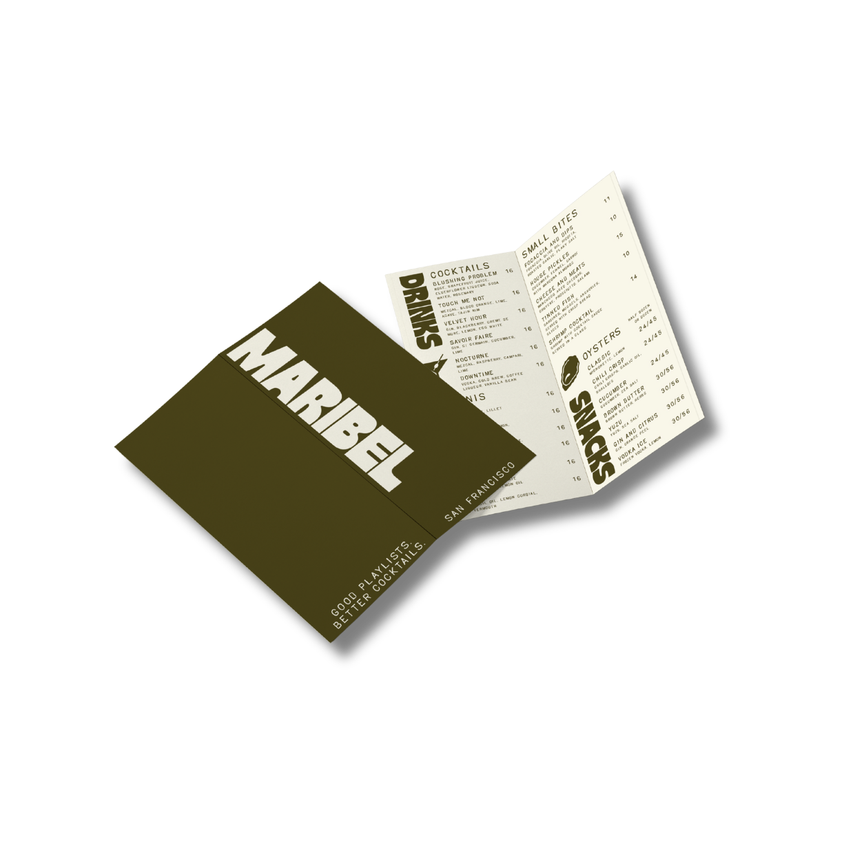
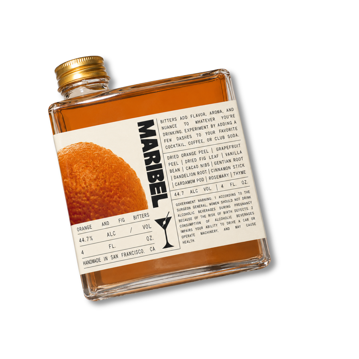
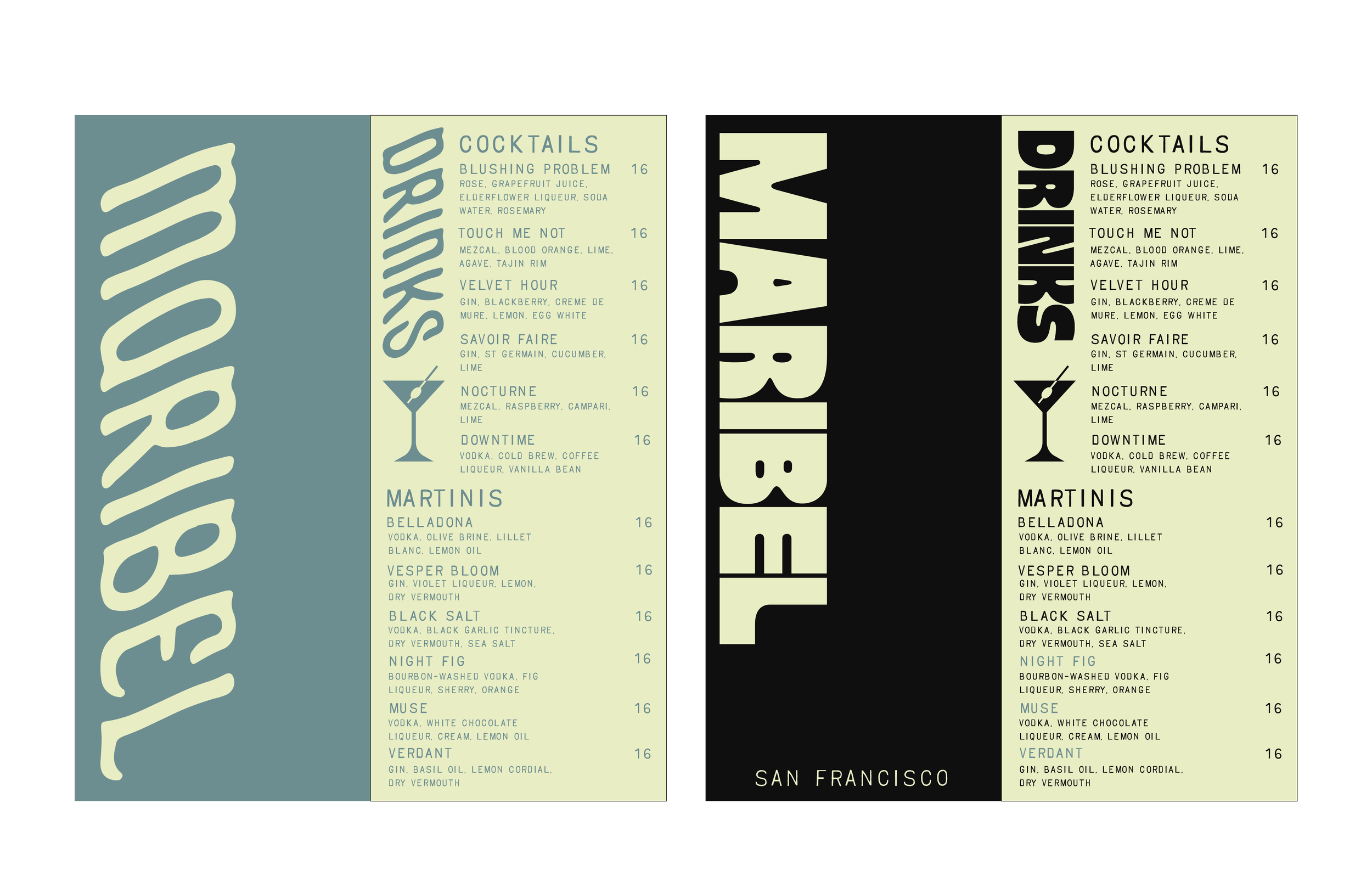
The final outcome for Maribel is a cohesive brand system that translates seamlessly across print and digital touchpoints. From menus and signage to social assets and collateral, each piece reflects the bar’s moody, refined atmosphere while maintaining a sense of ease and approachability. The combination of bold typography, warm tones, and clean layouts creates a distinct identity that feels both elevated and lived-in, capturing the essence of a space designed for connection and experience.