MUSE PERFUME
design brief
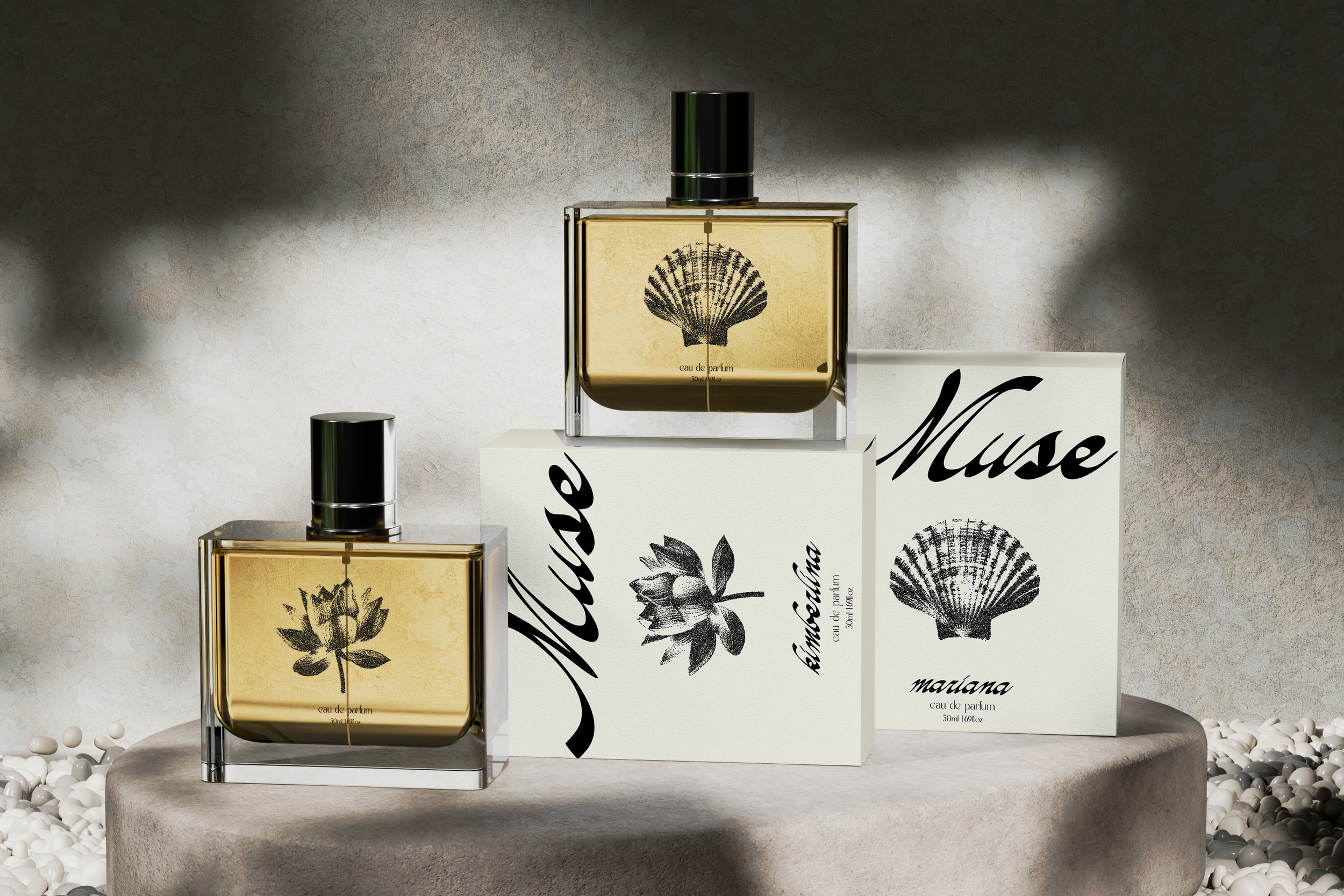
This personal project draws from the women who shaped me—translating their essence into a collection of fragrances. Each scent is named after a woman in my family and reflects her energy, presence, and the subtle ways she exists in my memory. The brand explores perfume as something intimate and lasting—less about luxury, more about connection, identity, and what lingers.
moodboard
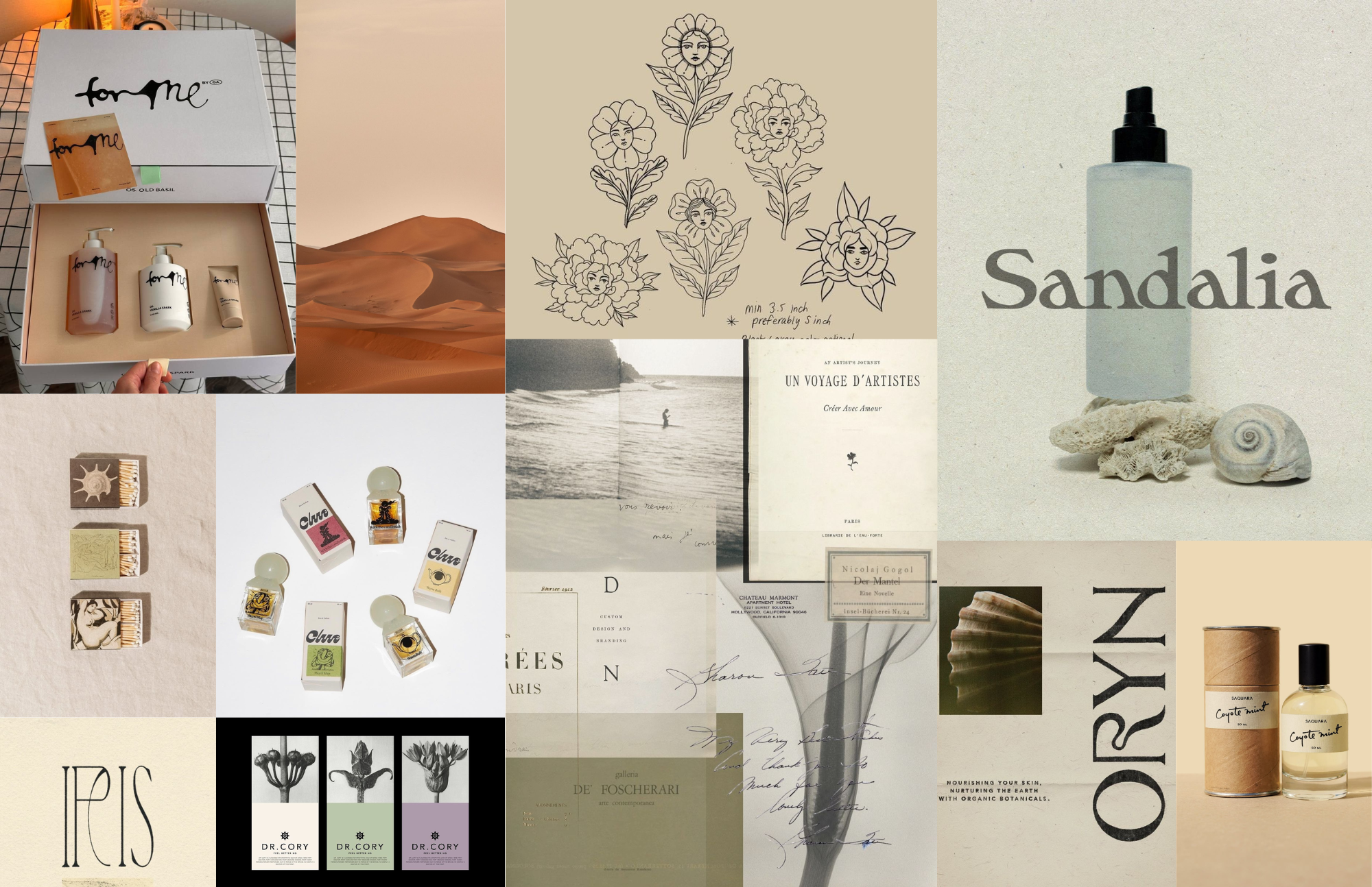
The visual direction explores memory, femininity, and natural form through a soft, archival lens. Inspired by vintage ephemera, botanical illustration, and coastal landscapes, it uses a muted palette, editorial typography, and tactile textures to create a quiet, intimate feel. Organic motifs like flowers and shells act as subtle symbols of identity, positioning perfume as something deeply personal—more about memory and presence than luxury.
progress
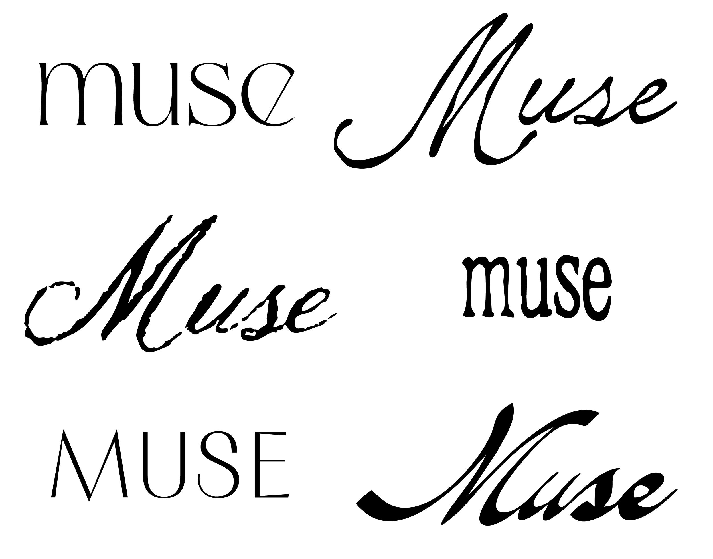
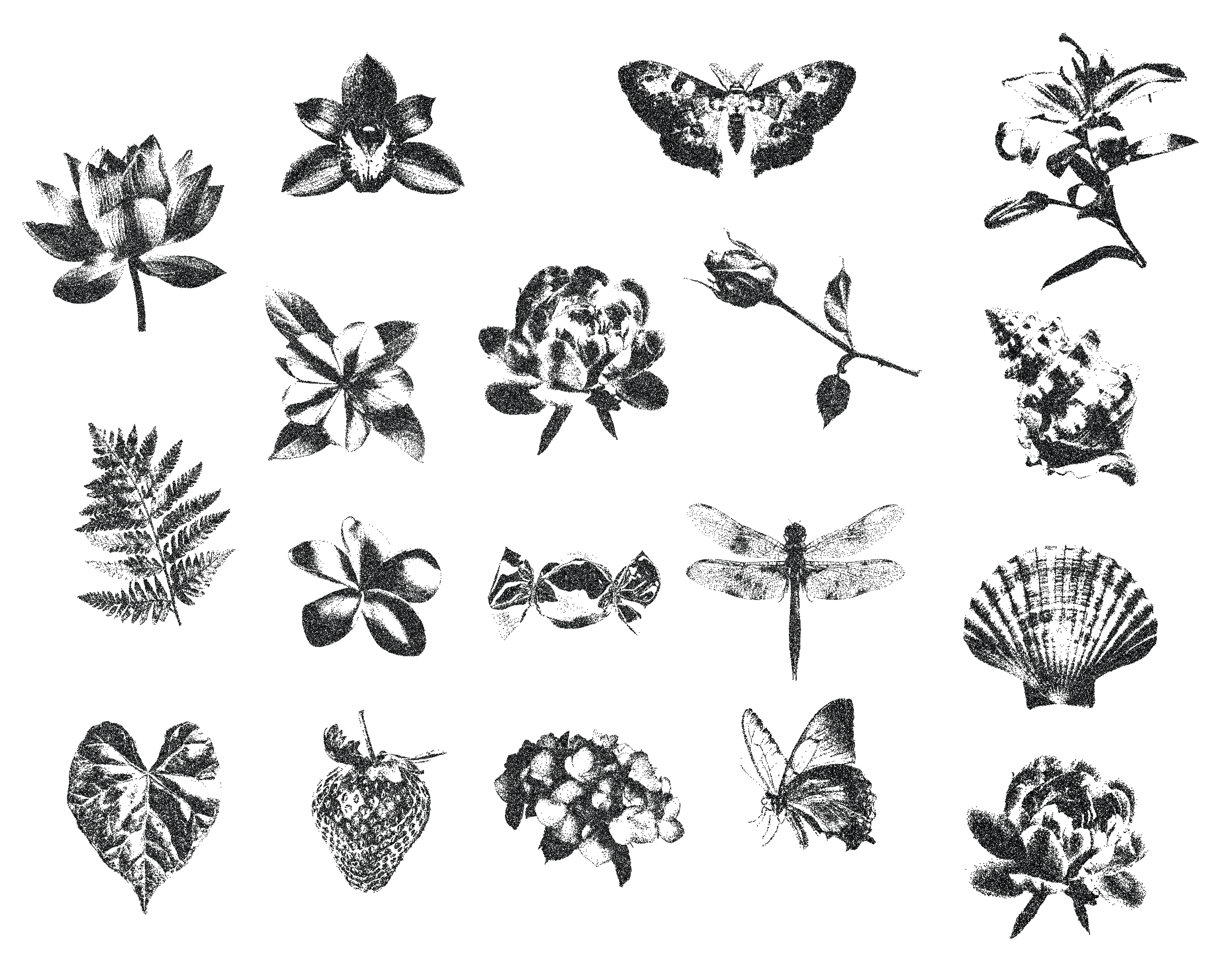
In developing the visual language, I explored using realistic photography to capture the natural elements behind each scent, then applied bitmap treatments to abstract and soften those images. This approach allows the visuals to feel both grounded and slightly removed—like a memory rather than a direct depiction—while still referencing the ingredients and environments that shape each fragrance. Alongside this, I refined the typography to feel elevated and restrained, leaning into a niche luxury space that prioritizes subtlety, intention, and quiet sophistication over overt branding.
outcome
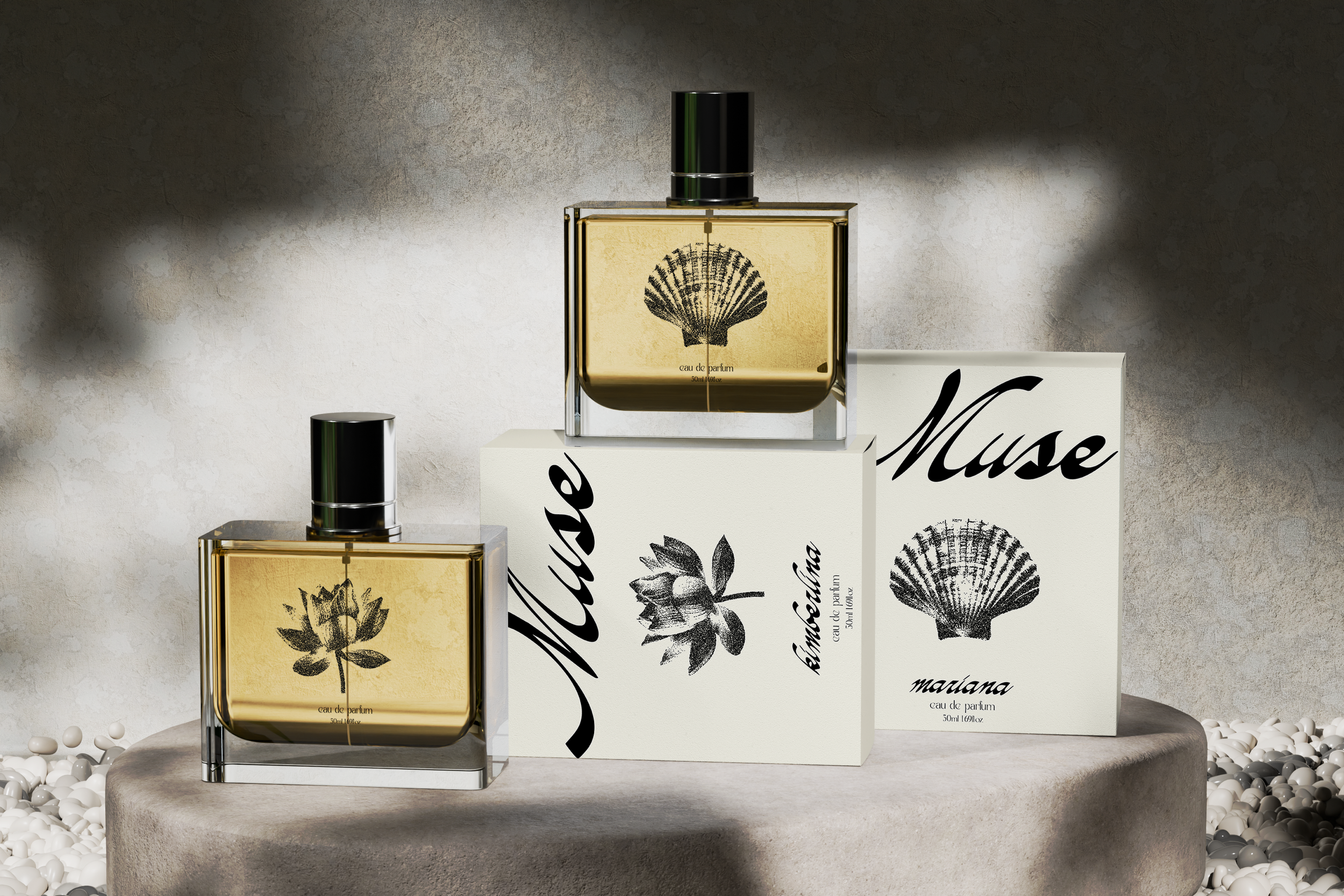
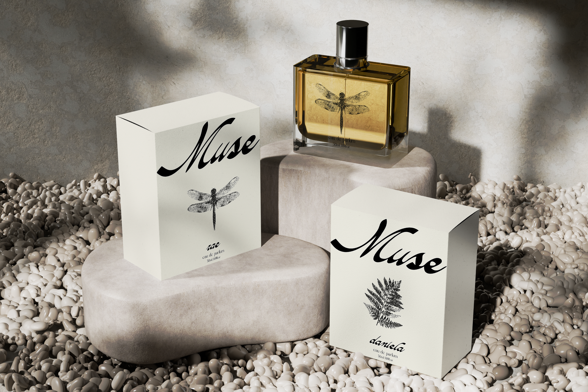
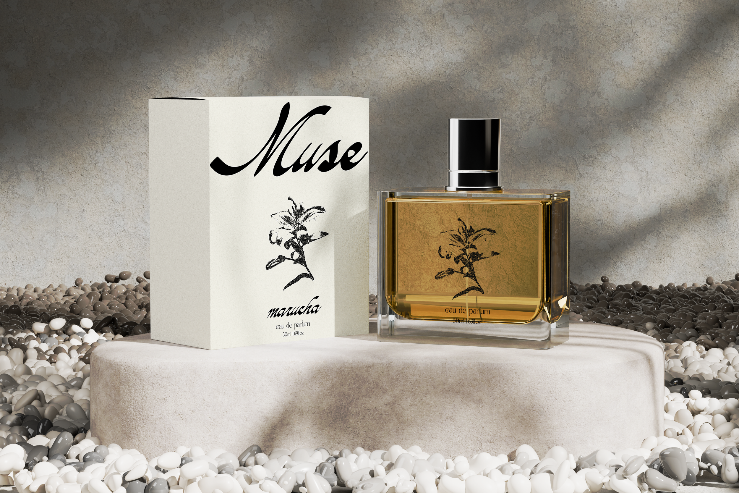
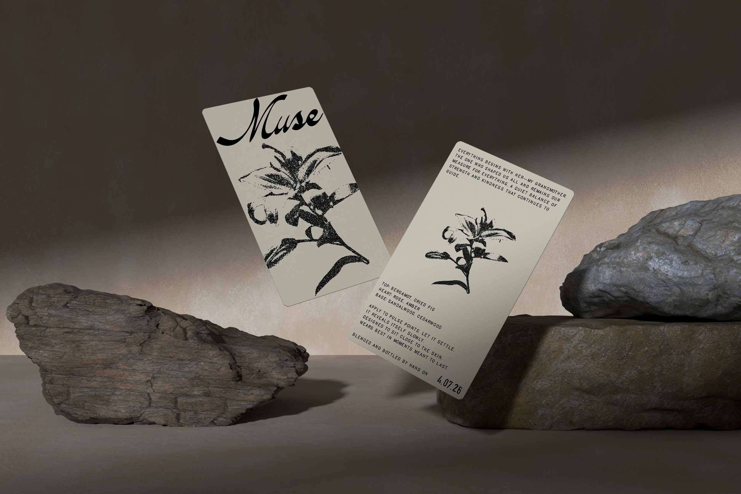
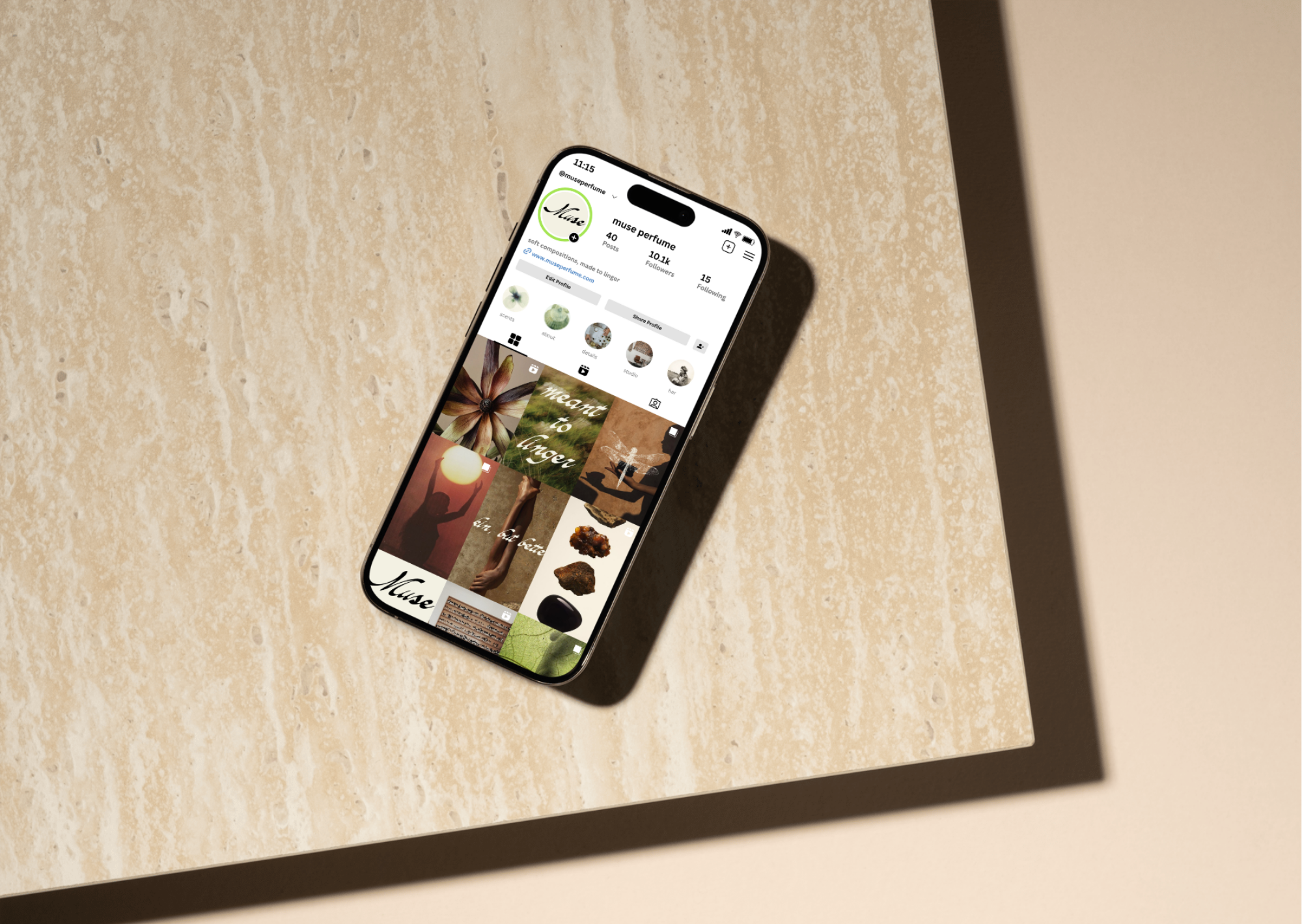
The final collection embodies a series of personal muses, translated into scent, form, and visual language. Soft, textural imagery and understated materials are contrasted with confident, sculptural typography, Across packaging, printed inserts, and digital presence, the system creates a quiet, intimate luxury that feels both personal and enduring.