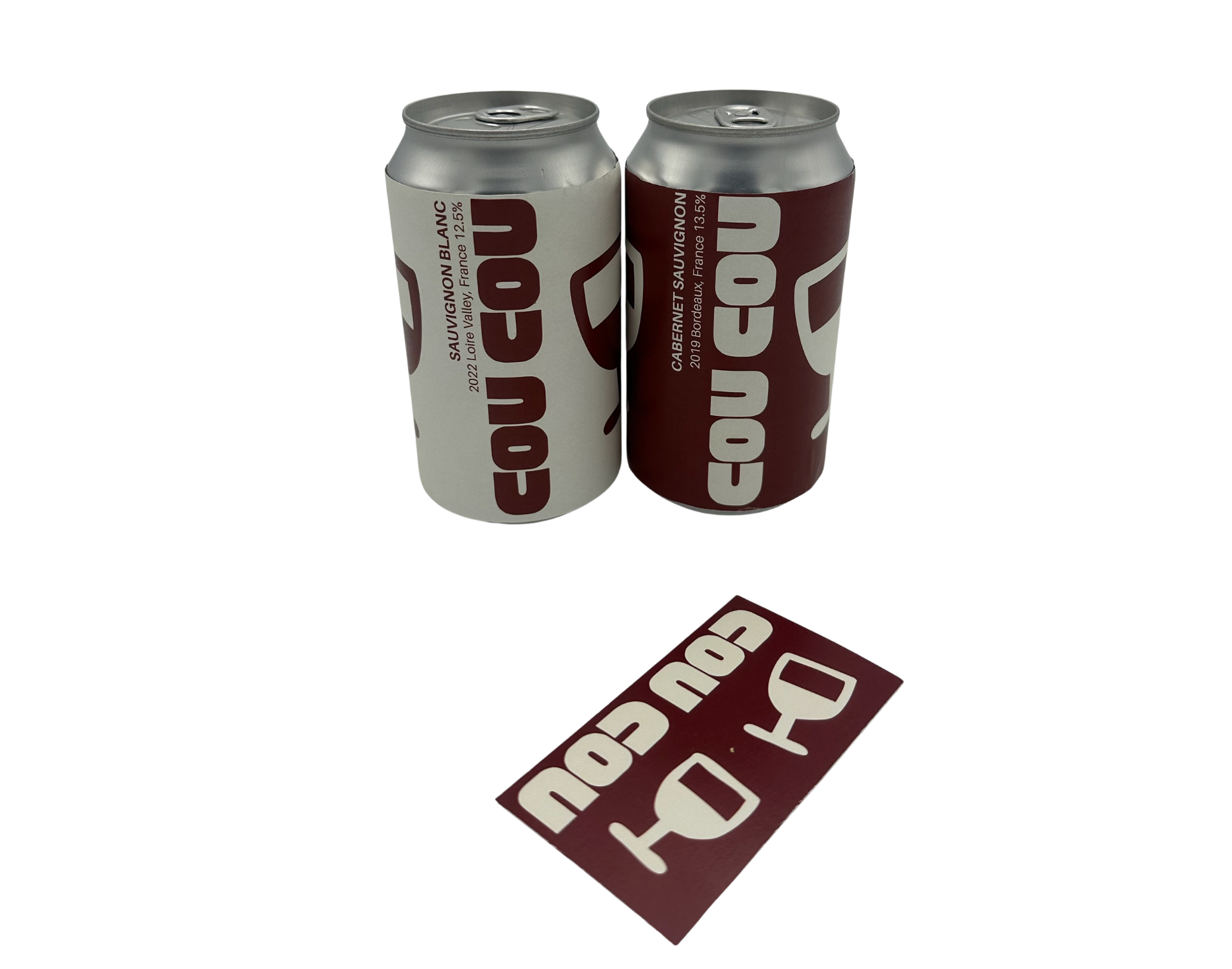
cou cou to go box
design brief
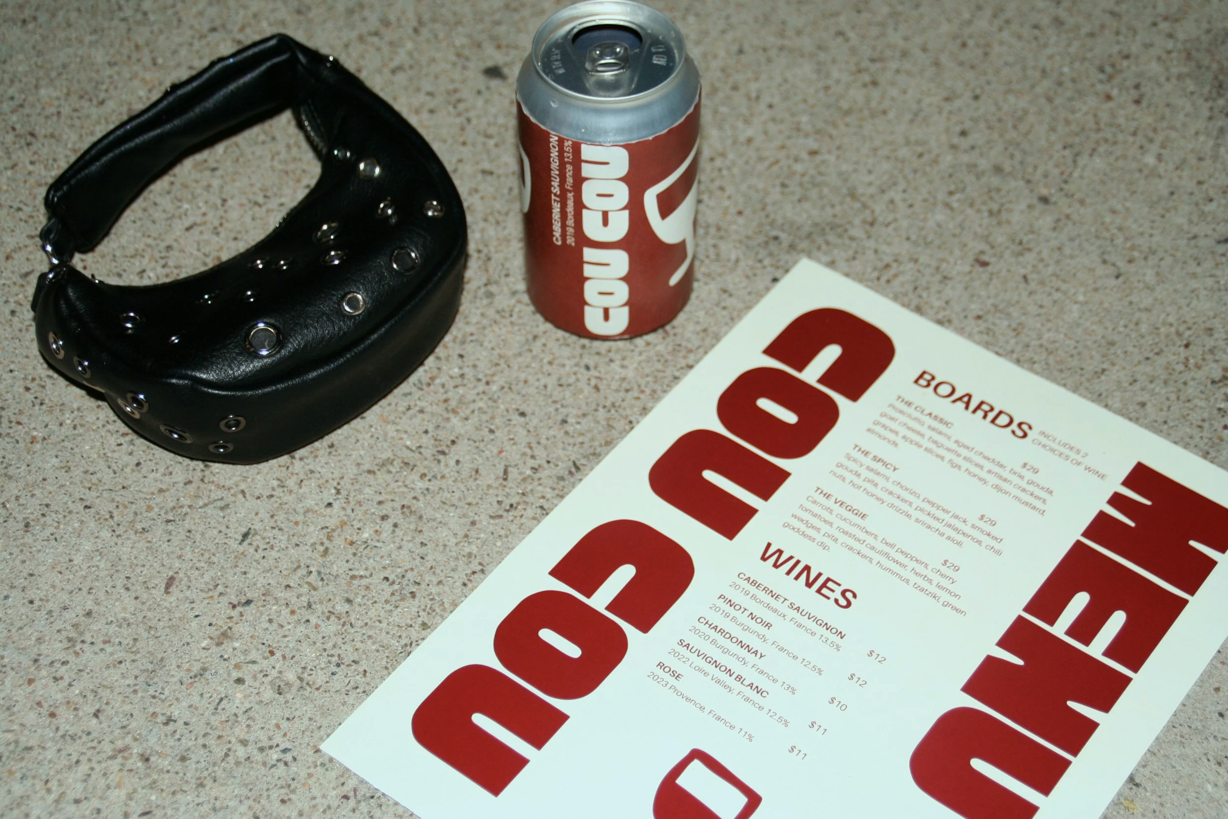
for art 450 packaging design class, we were tasked with a project that challenged us to identify a locally owned or create a food truck or small restaurant and design a fully branded takeout packaging system that reflects the business’s identity and values.
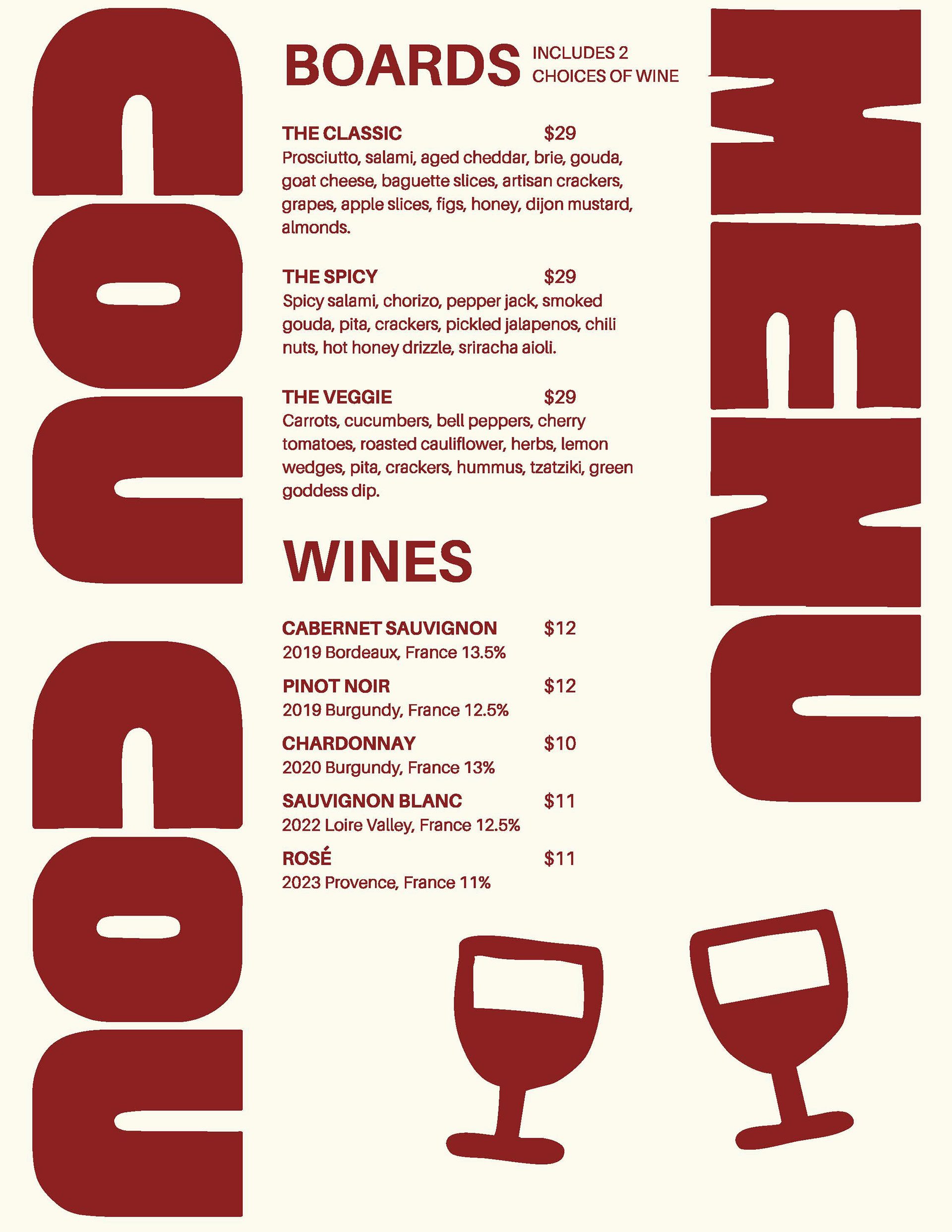
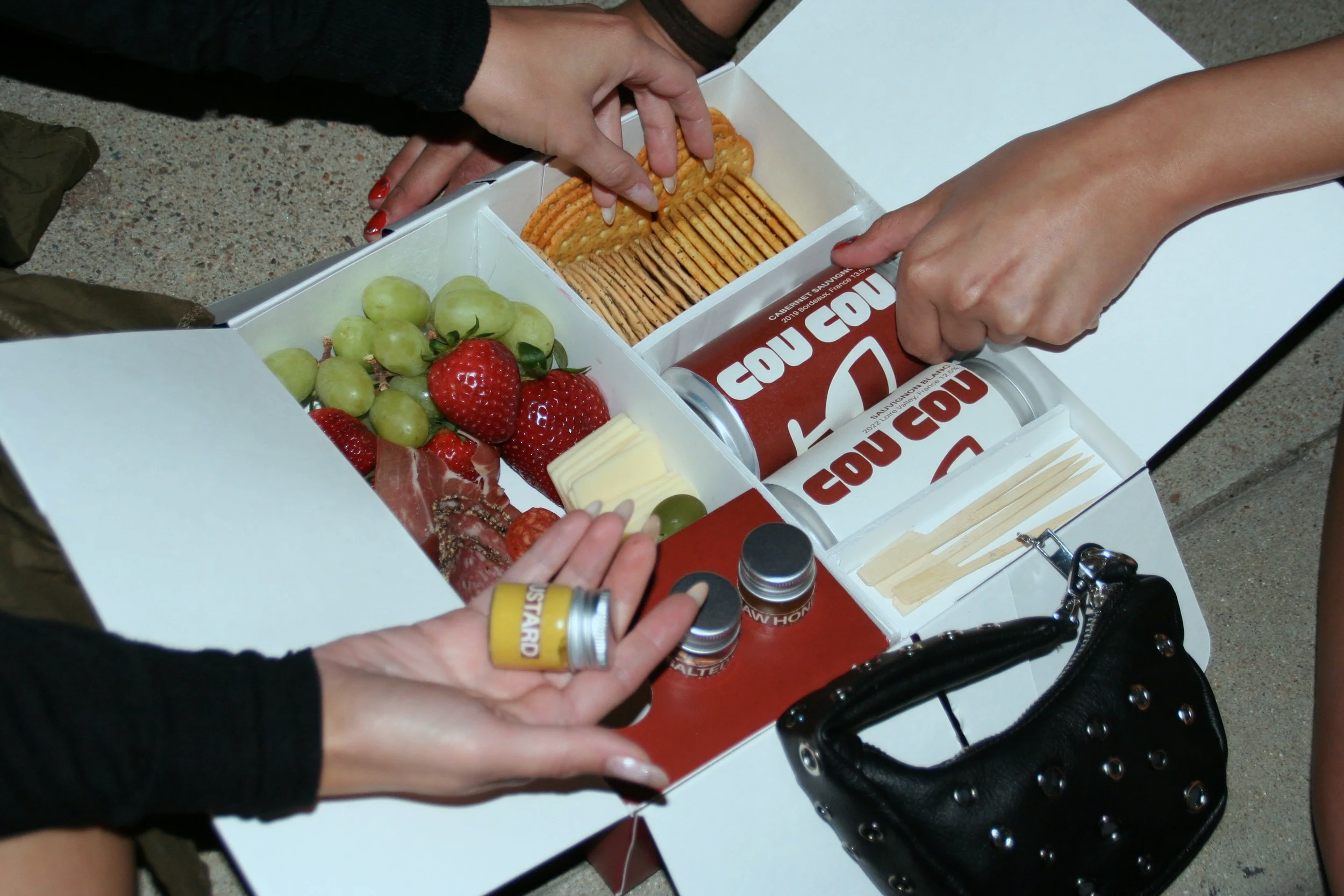
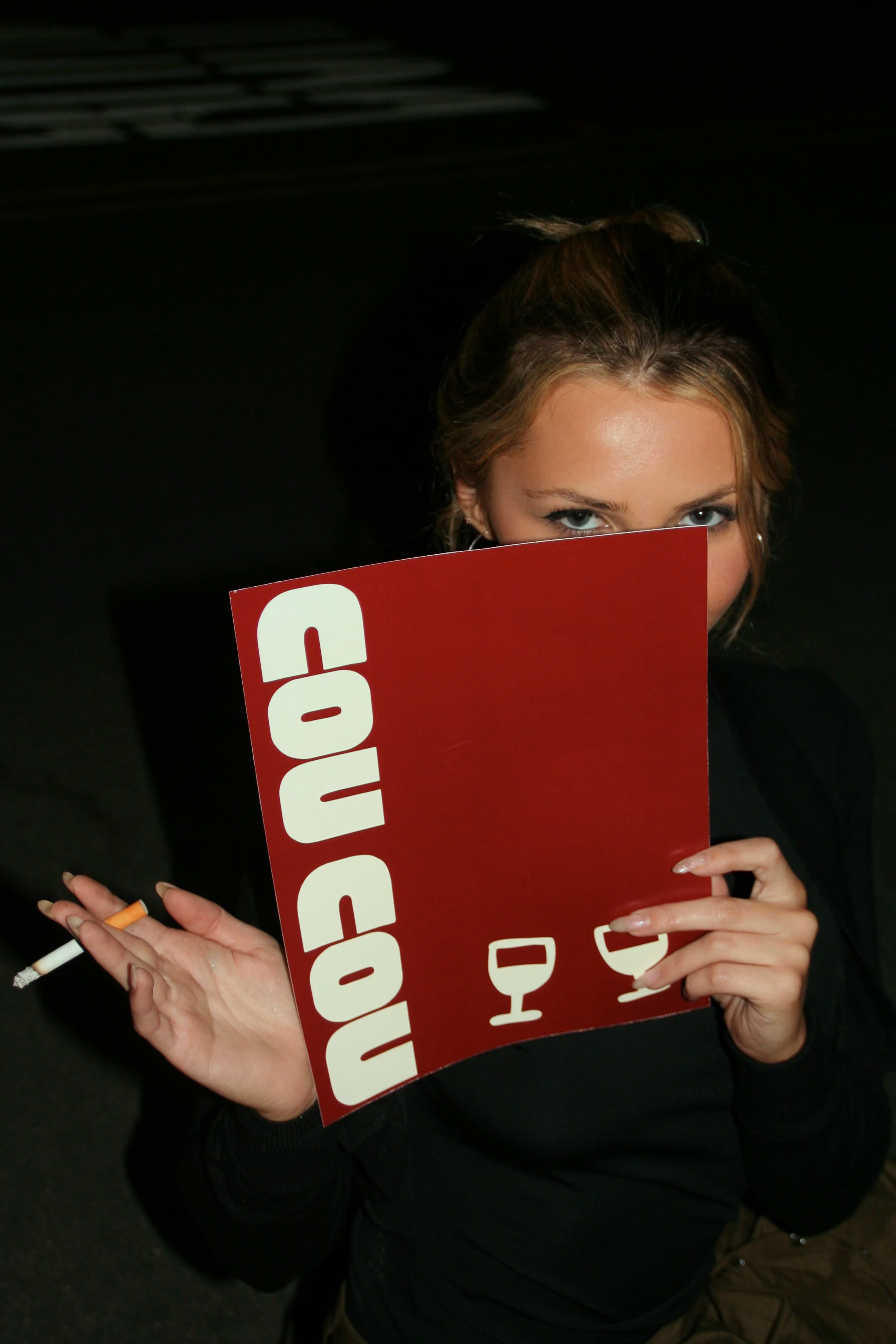
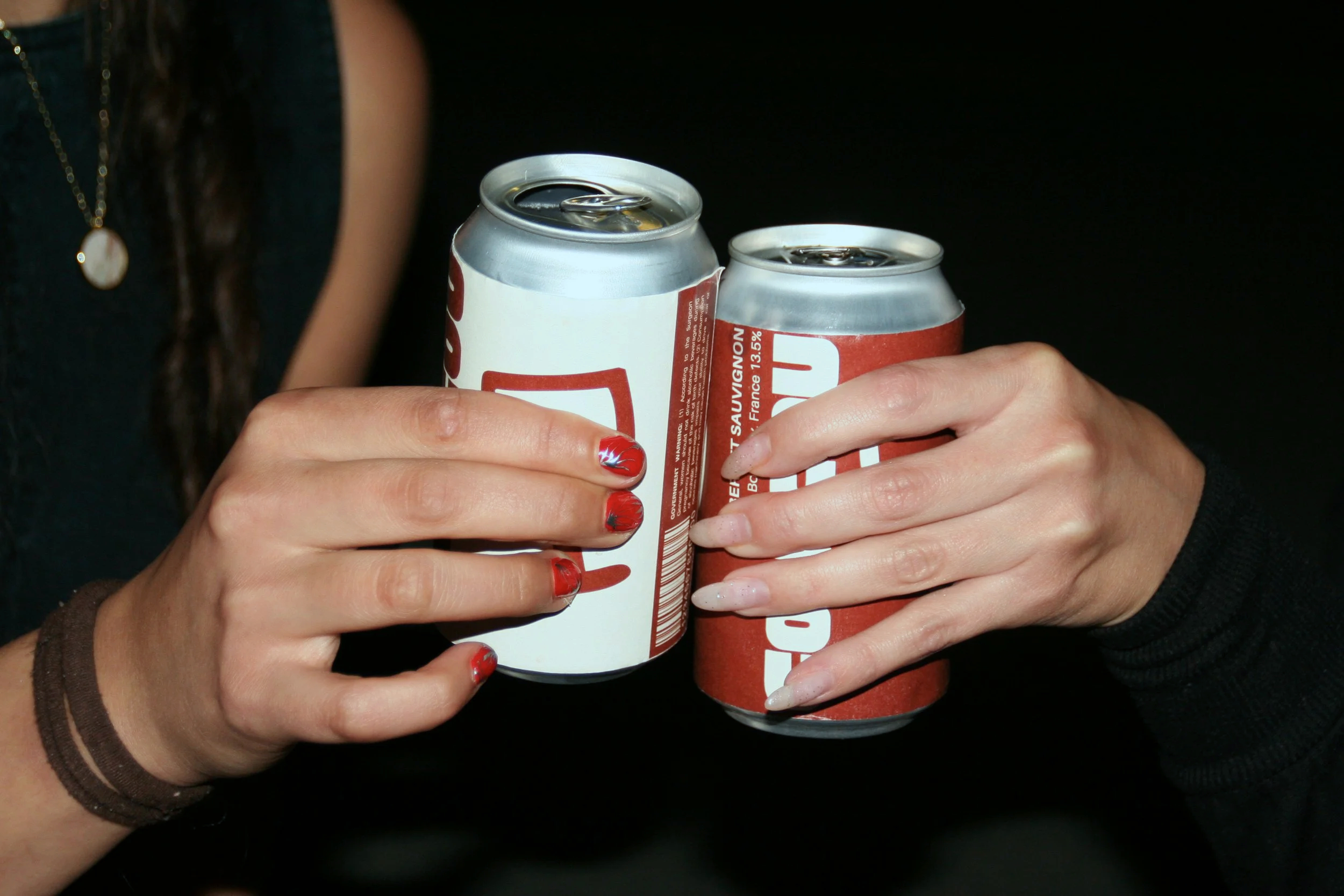
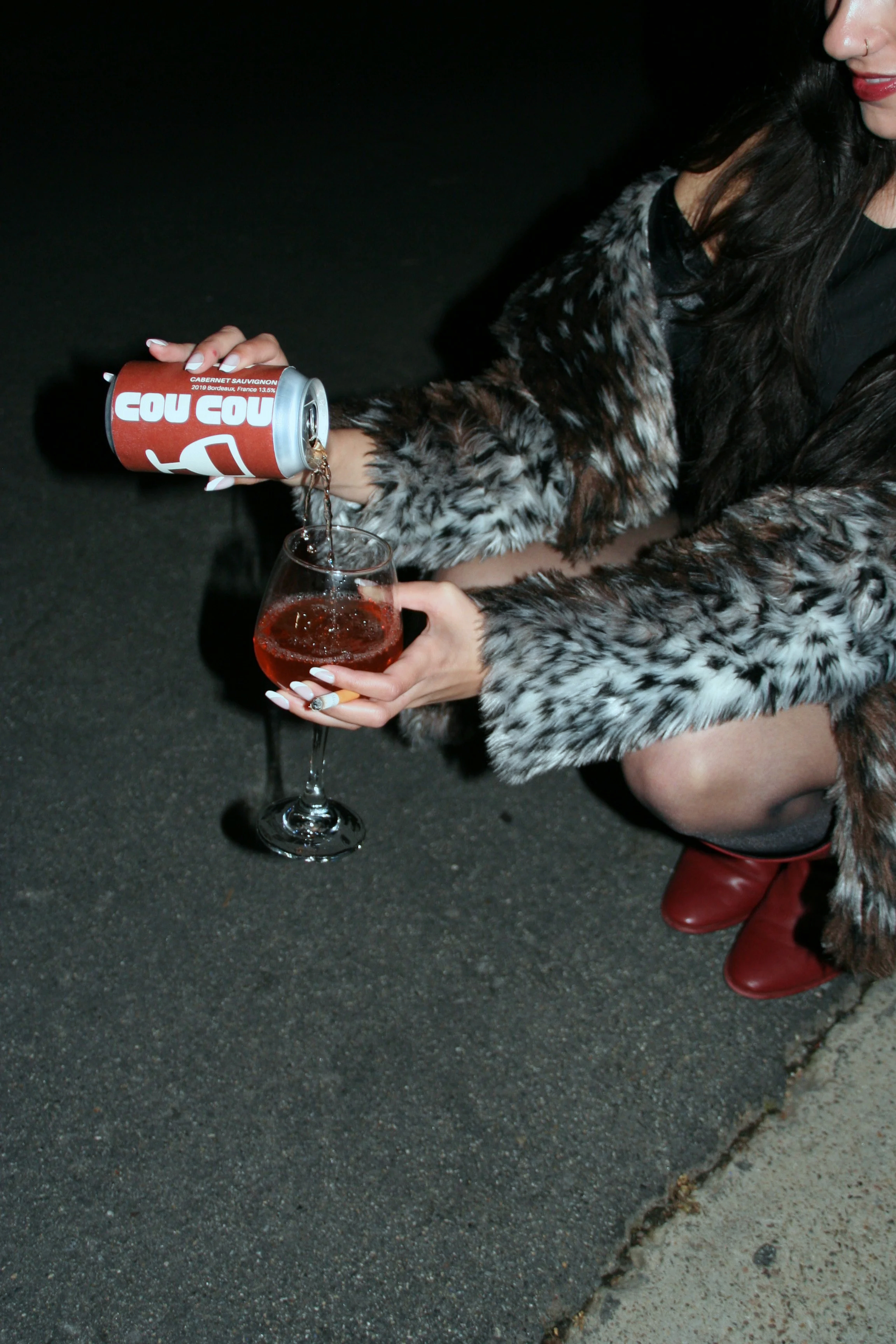
for the project, my classmate and i created a charcuterie cart. we wanted a san diego based concept that merges parisian café culture with california’s casual lifestyle. from there, we went our different ways in how we would approach our to go boxes and branding. i developed a sustainable, visually cohesive packaging system that reimagines portable charcuterie through an elegant yet approachable design.
progress
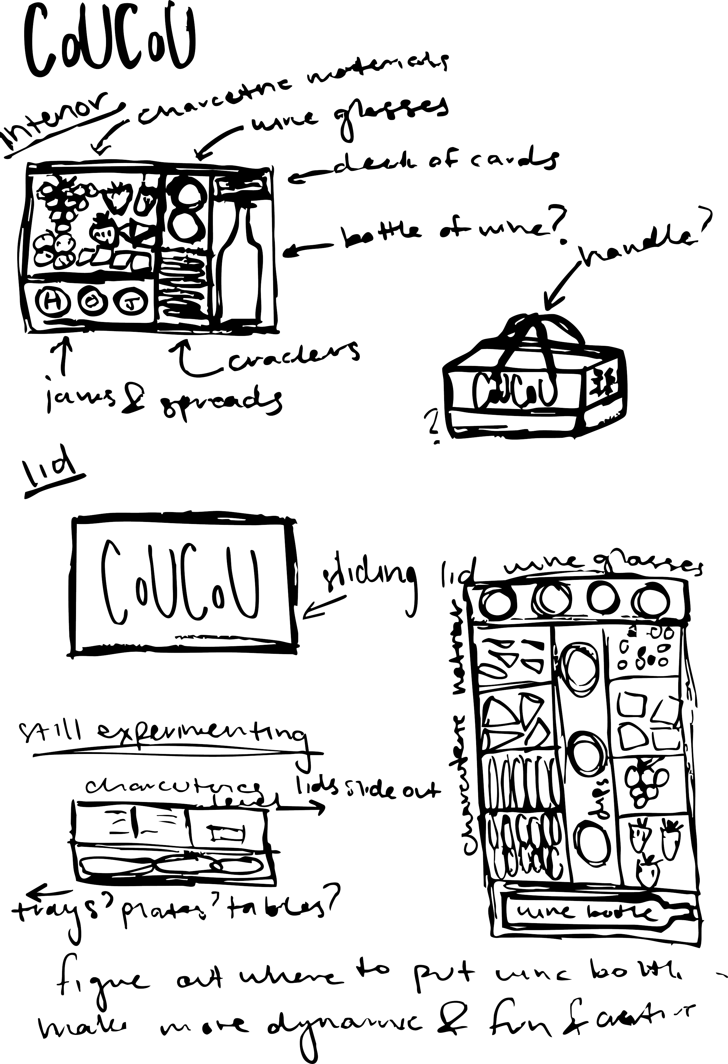
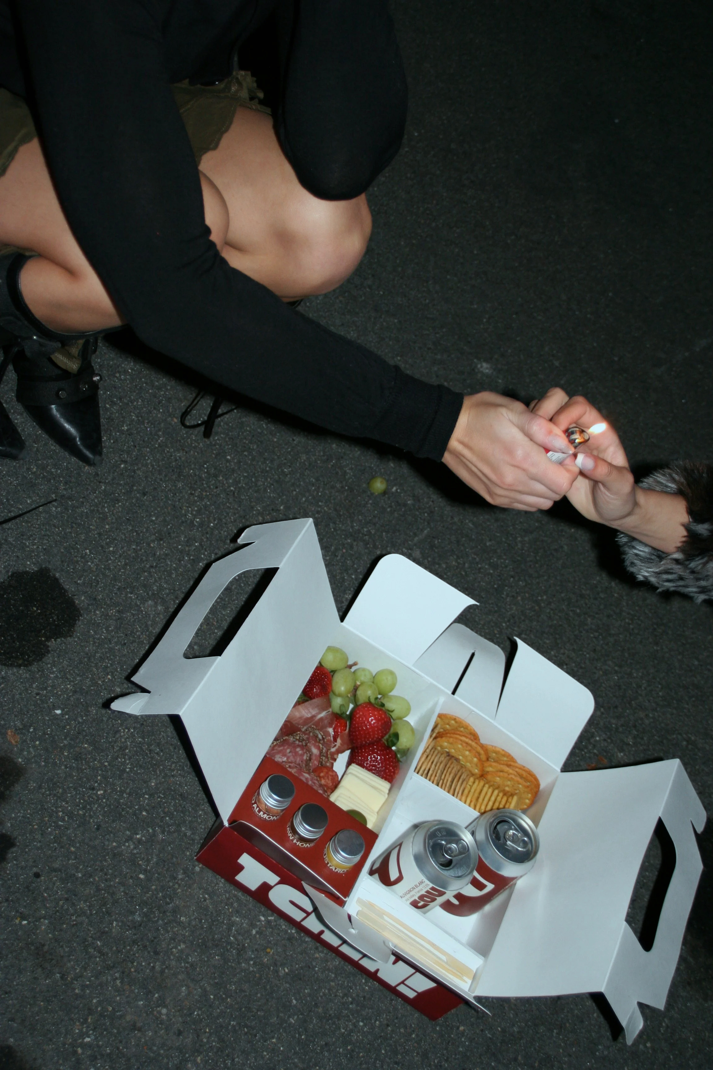
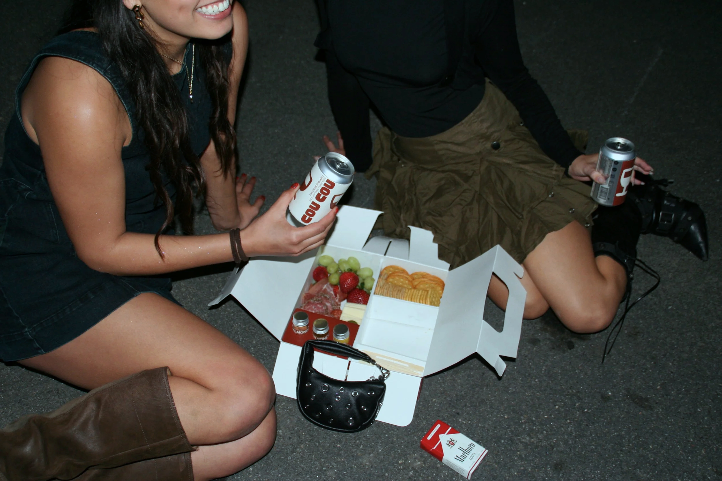
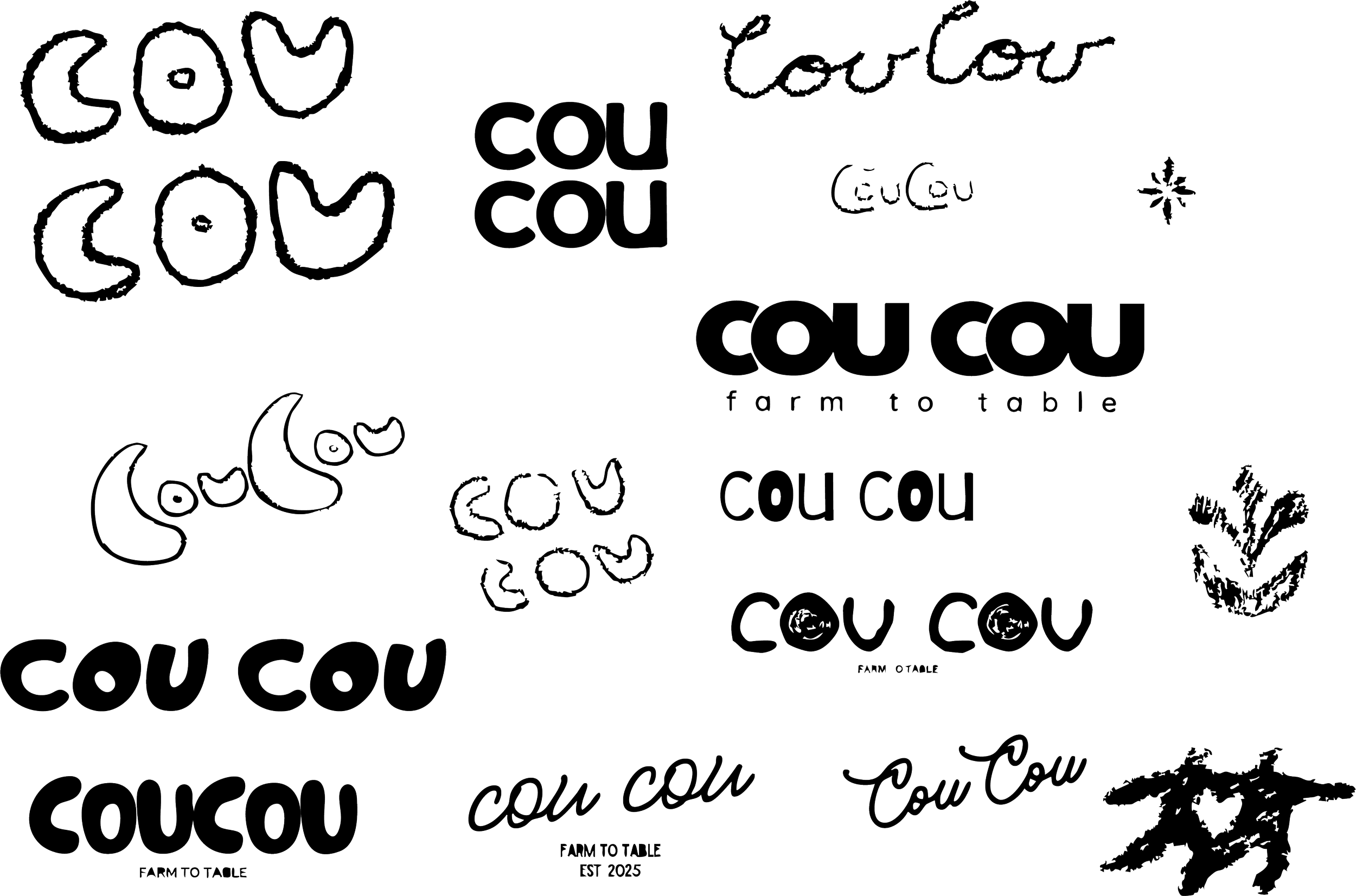
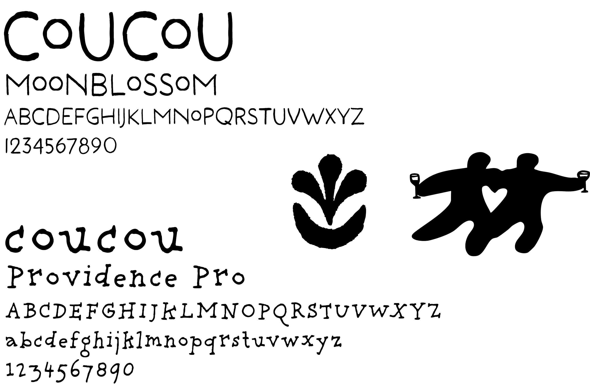
early sketches looked at structural ideas, focusing on layout, portability, and compartments for cheeses, jams, crackers, and wine, early Logo concepts explored playful, hand drawn typography inspired by French café culture, using certain typefaces to convey an artisanal, community driven feel.
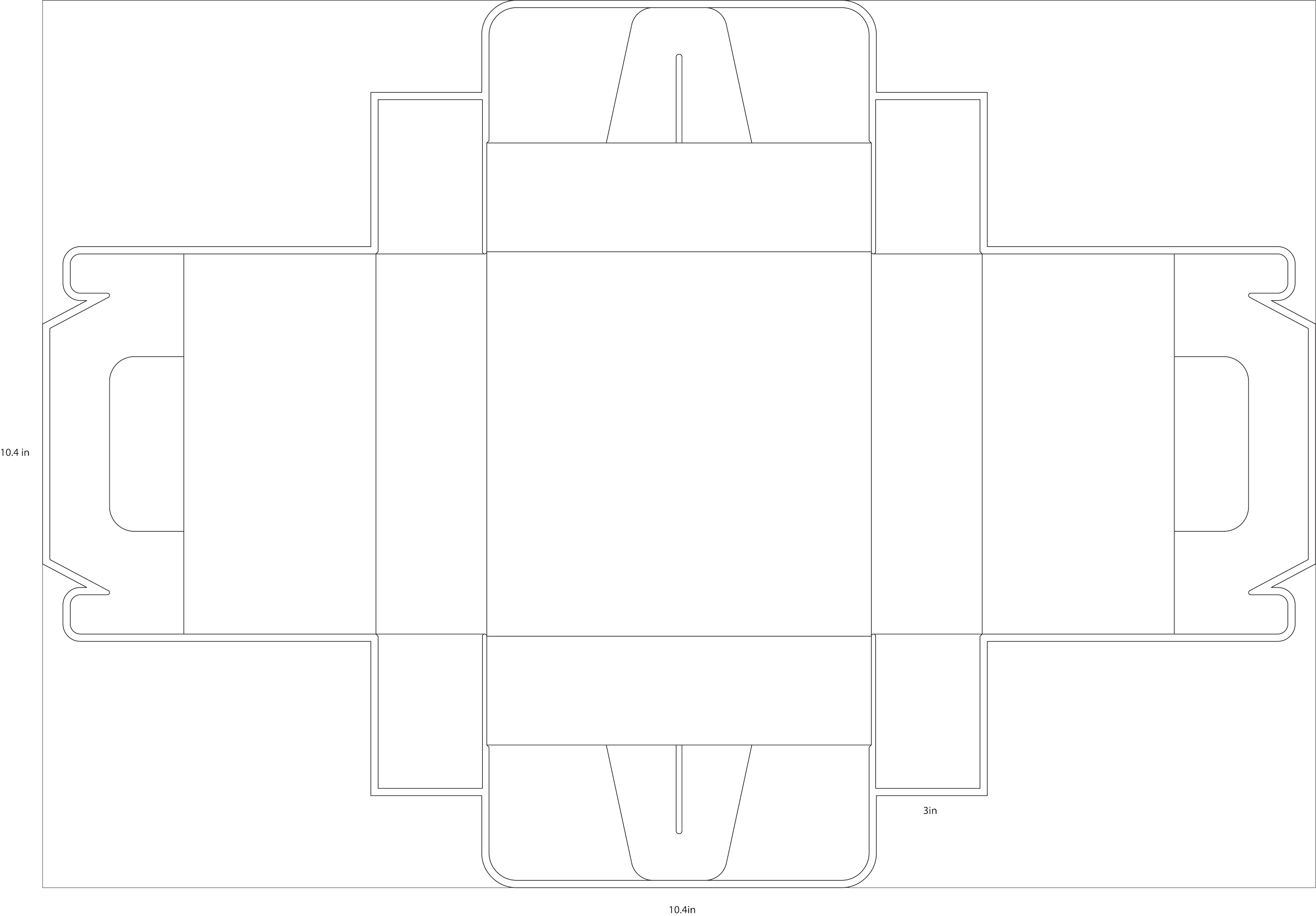
prototype & dieline
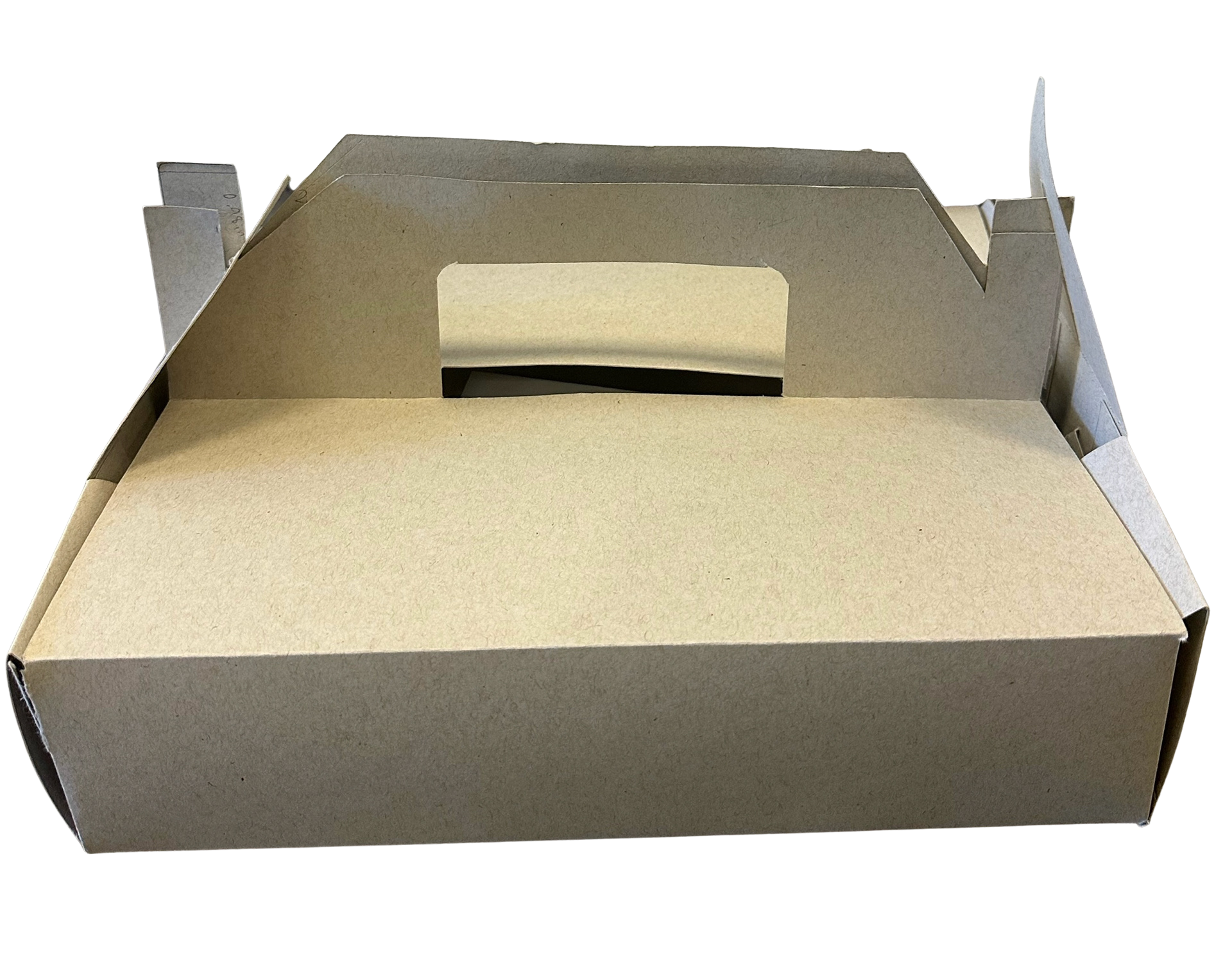
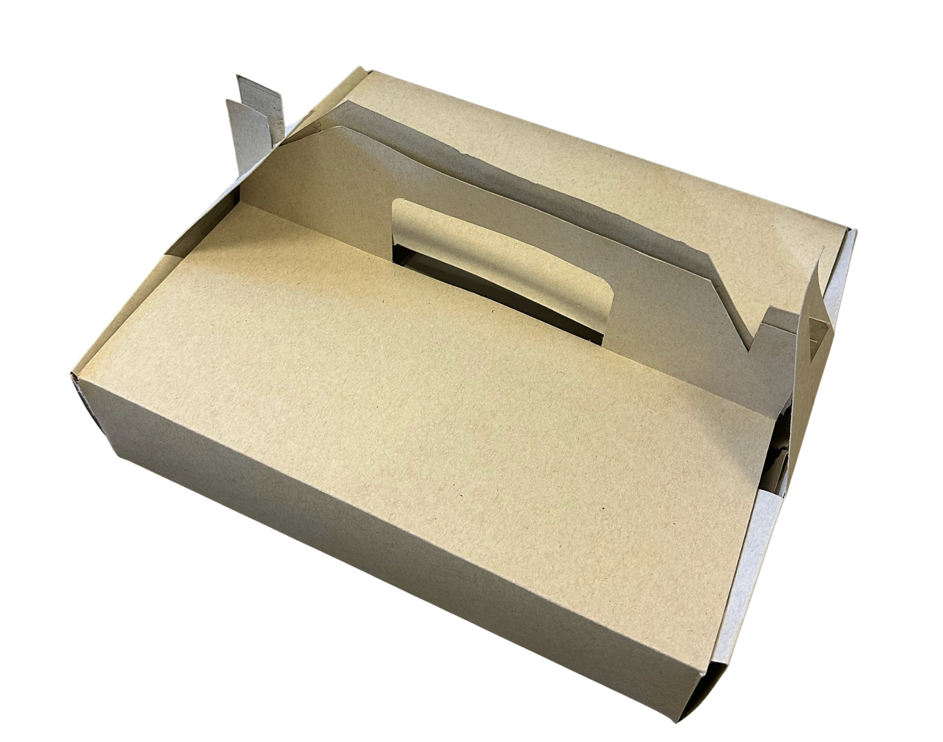
the first prototype tested scale, folding mechanics, and portability. made from kraft paperboard, it focused on creating a sturdy base with a handle for easy transport.
outcome
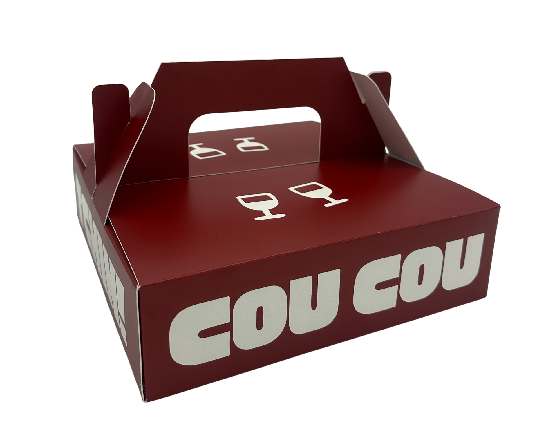
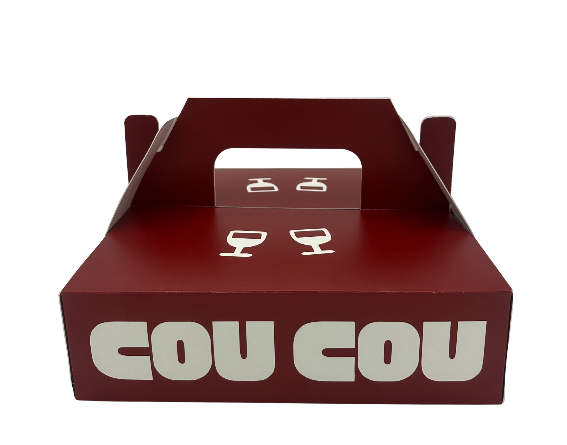
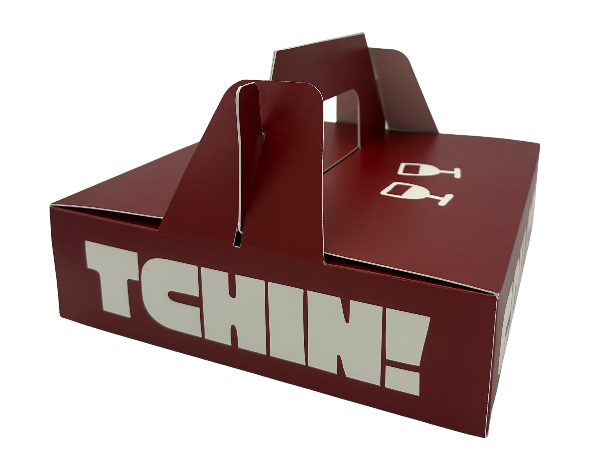
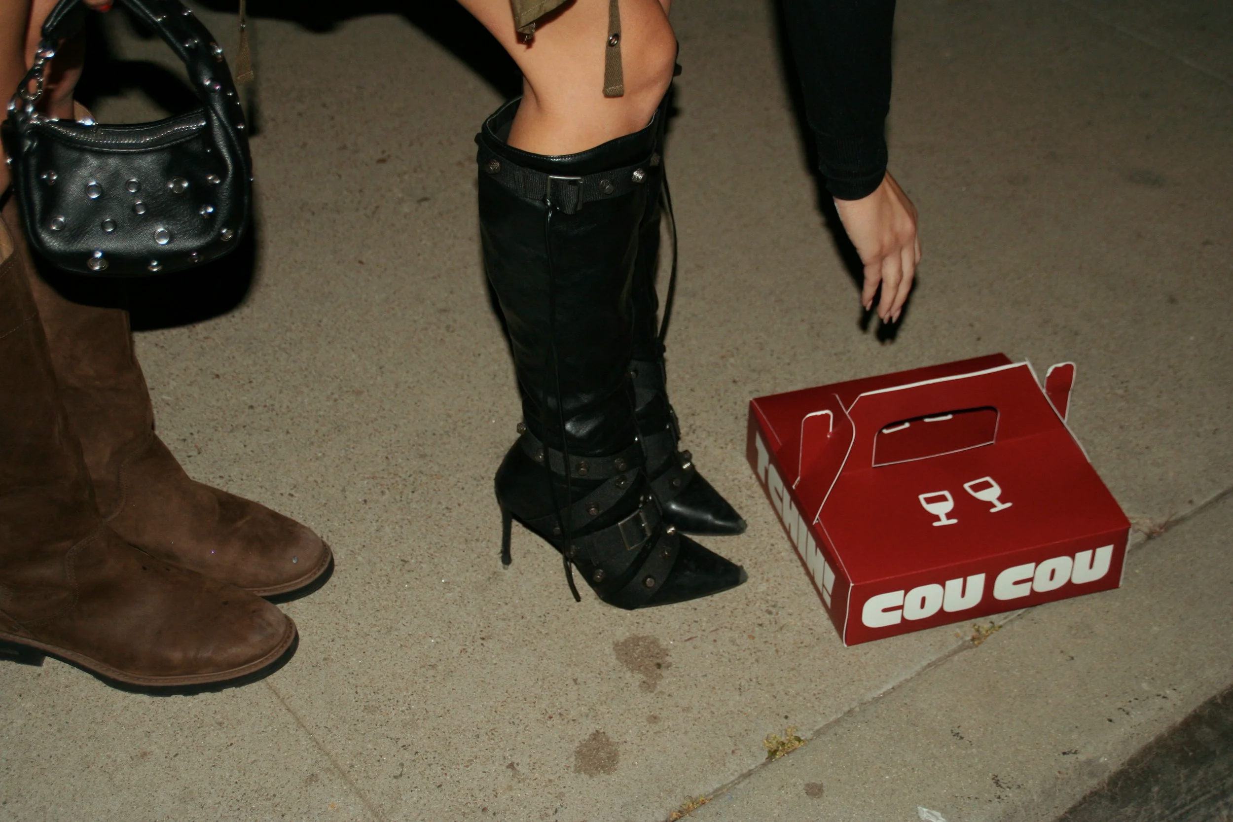
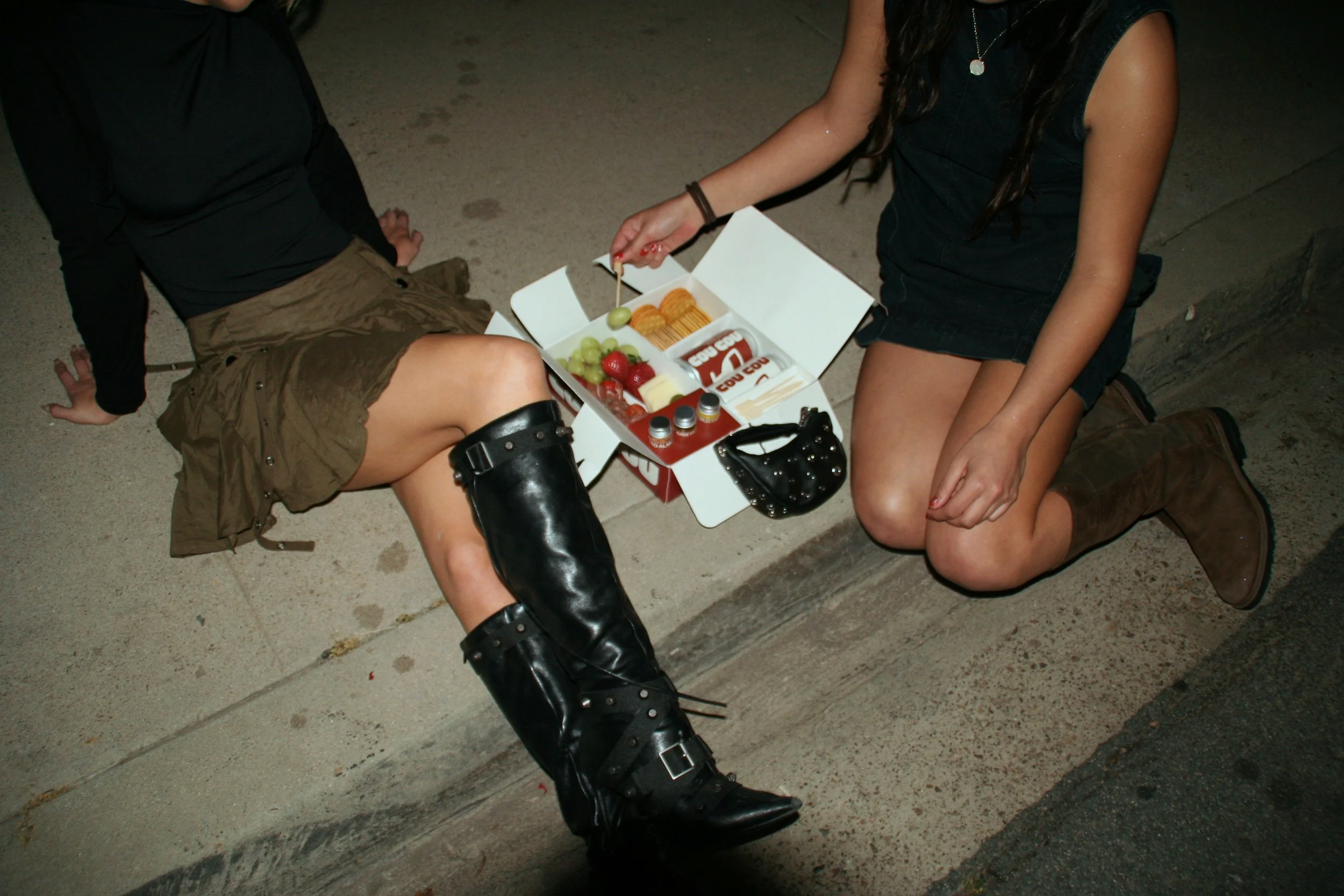
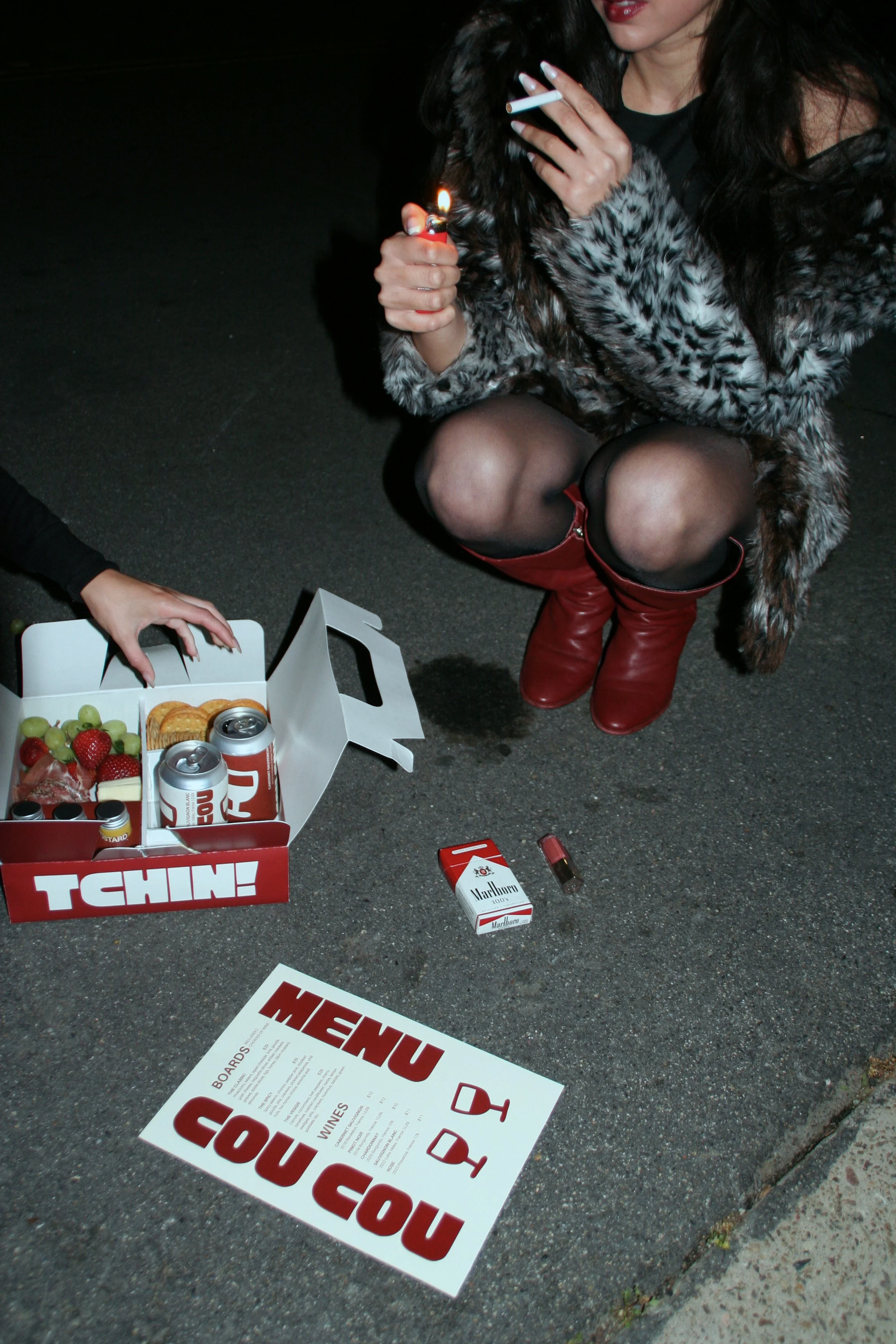
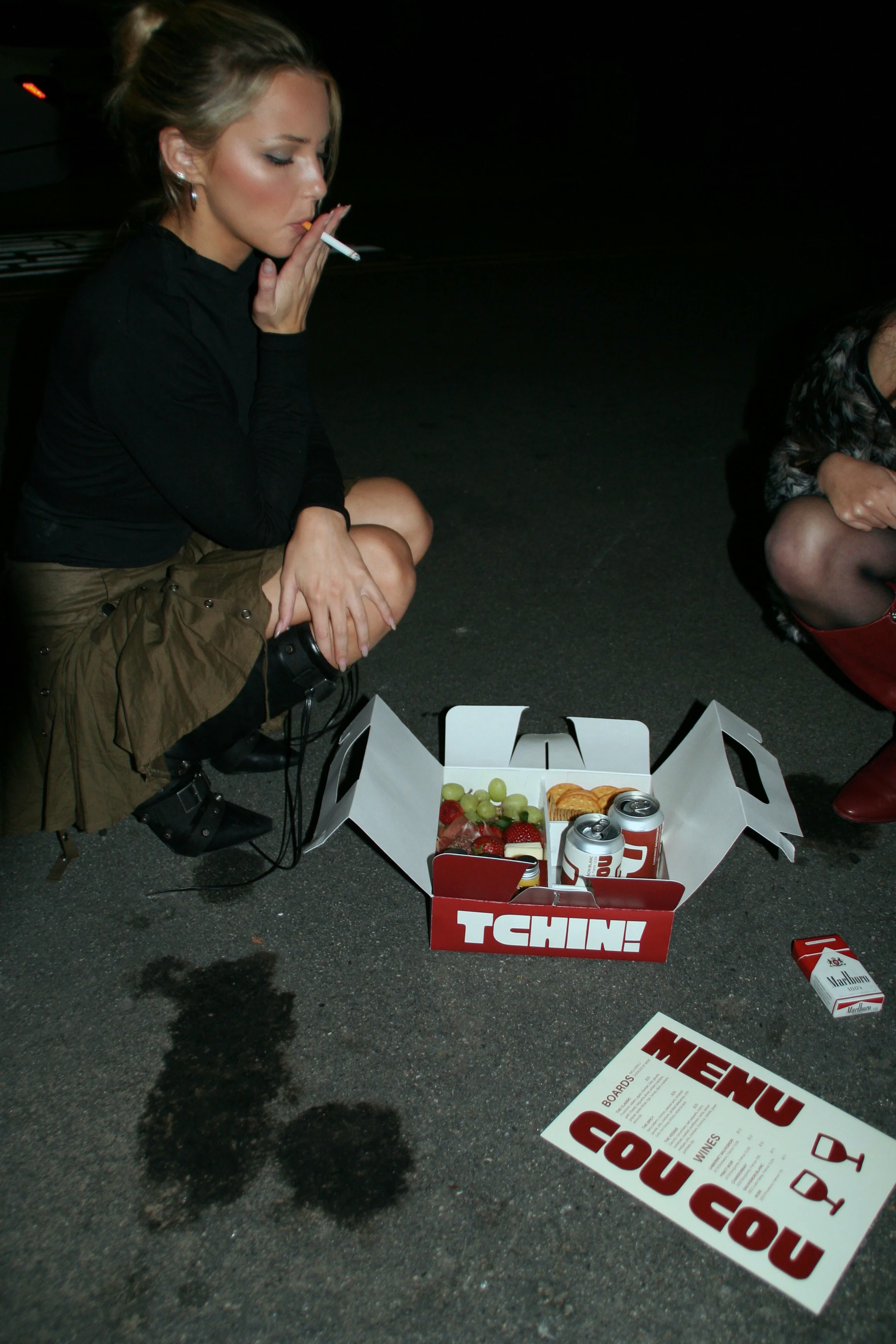
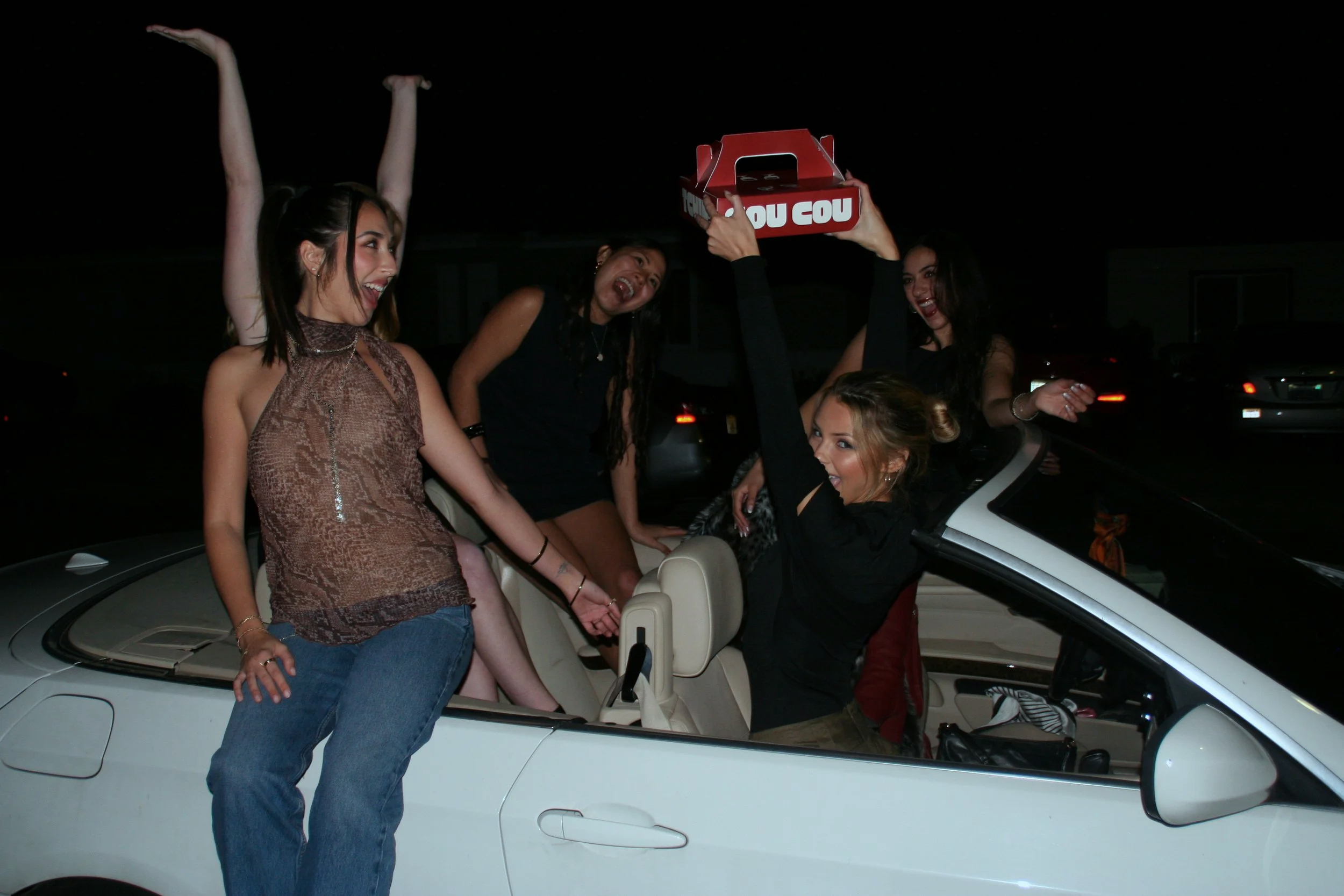
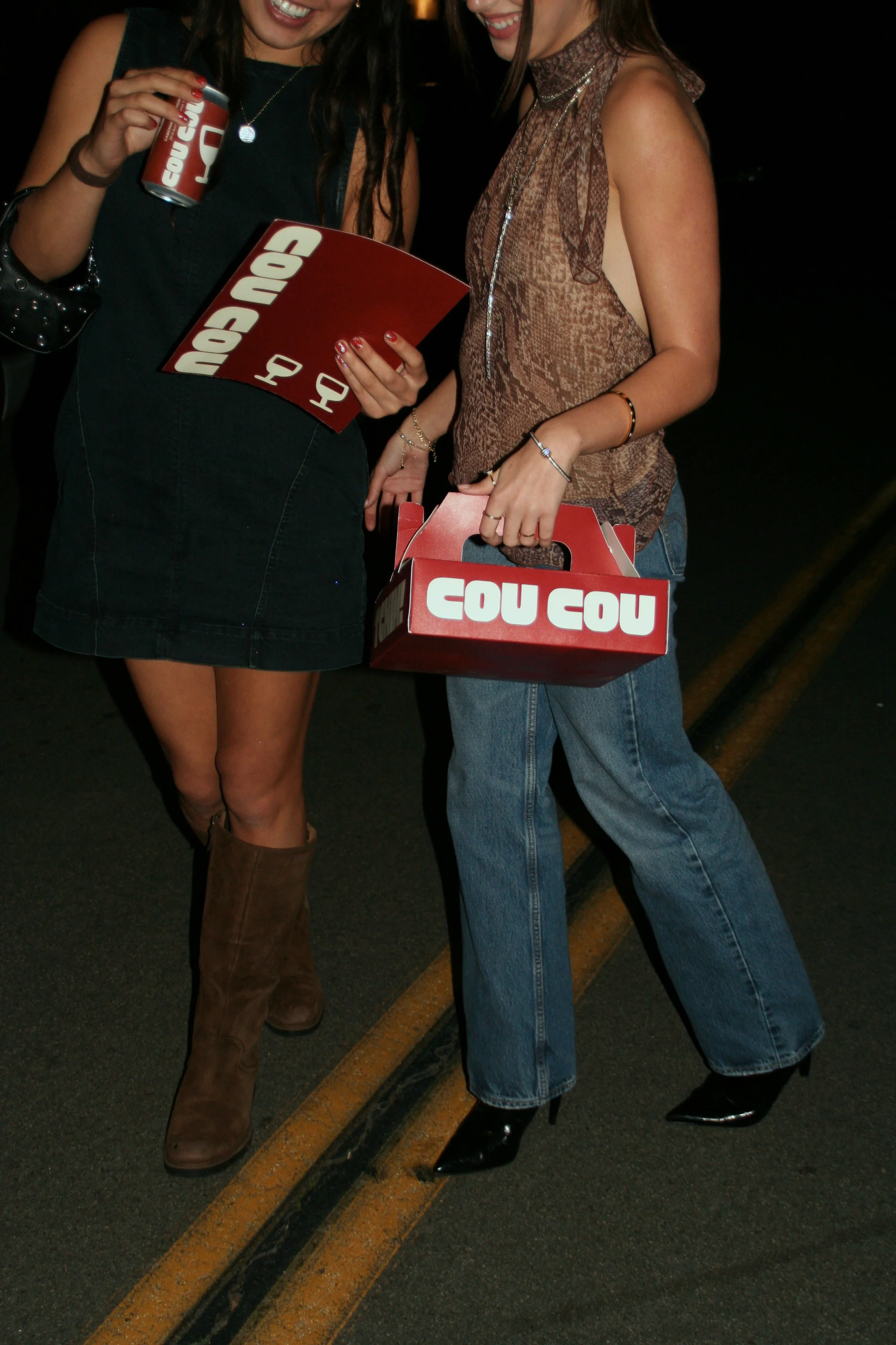
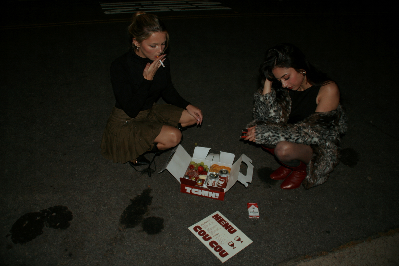
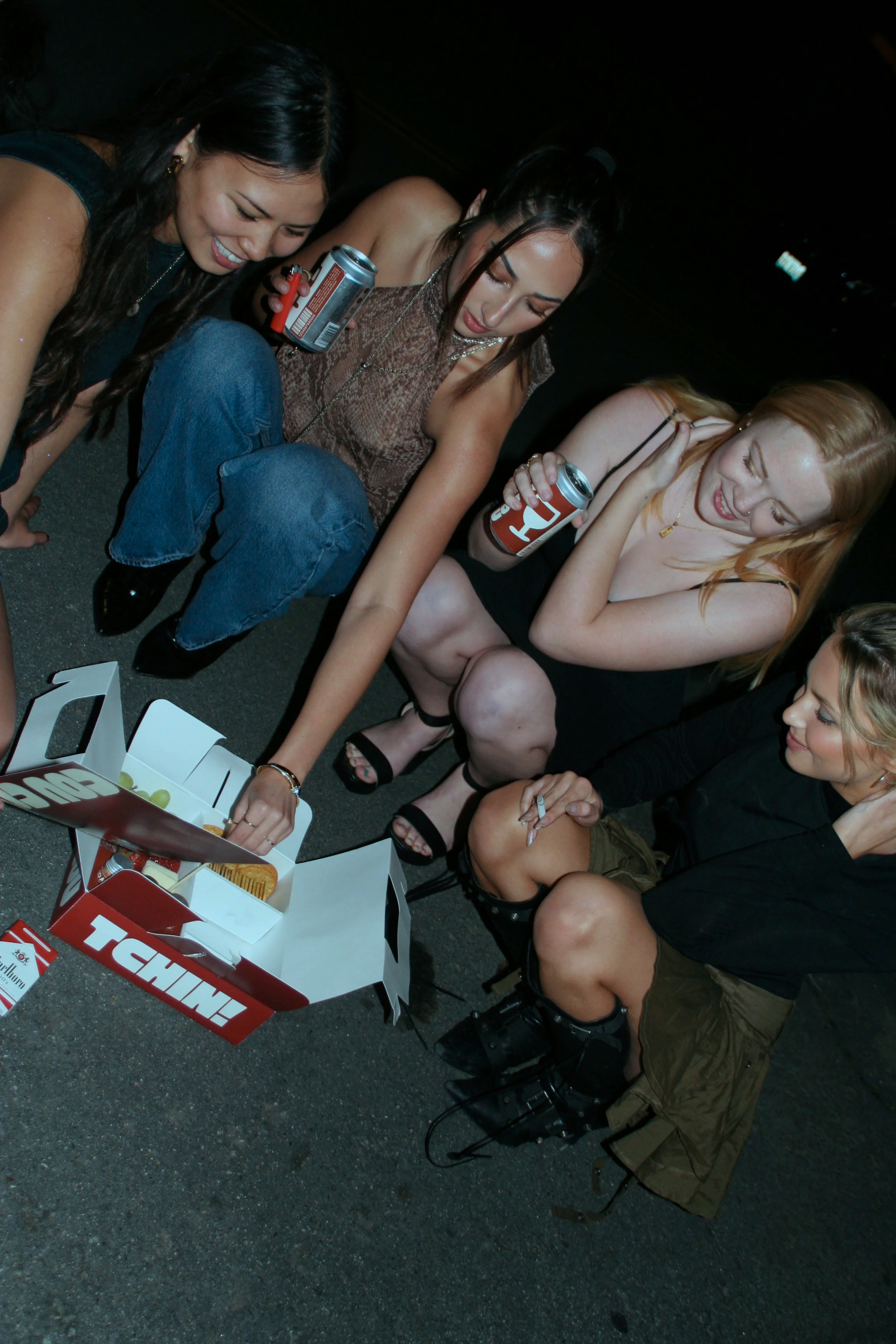
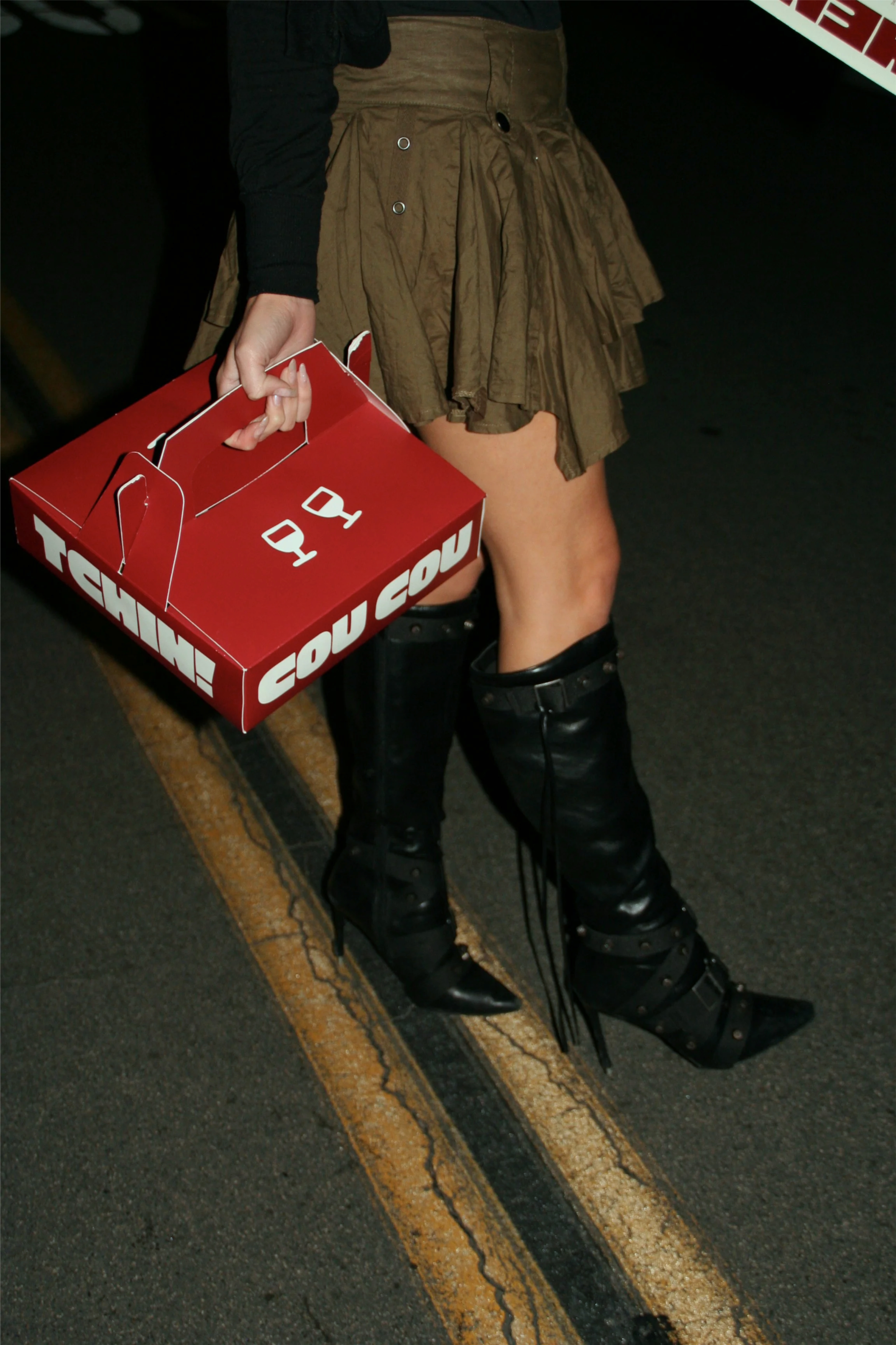
the final box reinforces the brand’s social and celebratory personality. the sturdy, structure with an integrated handle makes it easy to transport while maintaining an elegant, premium feel. the large “TCHIN!” (french for “cheers”) adds a joyful touch, connecting the packaging to the brand’s convivial, wine and charcuterie experience.